Extending Scatterplots to Scalar Fields
📝 Original Info
- Title: Extending Scatterplots to Scalar Fields
- ArXiv ID: 1608.05773
- Date: 2016-08-23
- Authors: Shenghui Cheng, Pengcheng Cui, Klaus Mueller
📝 Abstract
Embedding high-dimensional data into a 2D canvas is a popular strategy for their visualization.💡 Deep Analysis
📄 Full Content
In SciVis, color and brightness typically encode the value of the primary attribute, such as temperature, density, speed, etc. In InfoVis, on the other hand, color and brightness are predominantly employed to encode the membership of points in certain clusters. Additional variables are most often encoded as point size -a popular example being Gapminder which codes the magnitude of a certain entity as size in its characteristic animated display. Using size to encode an attribute’s value, however, limits the resolution of the display.
The use of color and brightness to encode a primary attribute of the data -as opposed to the aforementioned cluster membership -is a frequent practice in SciVis. These types of displays are often referred to as scalar fields. Scalar fields are defined over a continuous domain and typically have a smooth and continuous appearance. An example is the variation of pressure or temperature over a geometric shape such as an airplane wing. In this work, we aim to adapt the notion of scalar field to InfoVis displays -namely to encode the value of a chosen attribute or interest. This brings the advantage that in contrast to using node size for this purpose, employing color or brightness does not limit the display’s resolution.
However, a significant obstacle in this endeavor is the inherent spatial disorganization of the InfoVis non-spatial data. Overcoming this limitation is at the heart of our paper. To achieve our goal, we propose a regularizing non-linear transform of the spatial organization of the data. This transform creates a smooth transition in the color-coded variable making it easy to see trends in the context of the other variables. Similar to scalar fields the visualizations we create are dense and not scattered. This enables other useful types of visualizations, such as iso-contours, topographic maps, and even extrapolations.
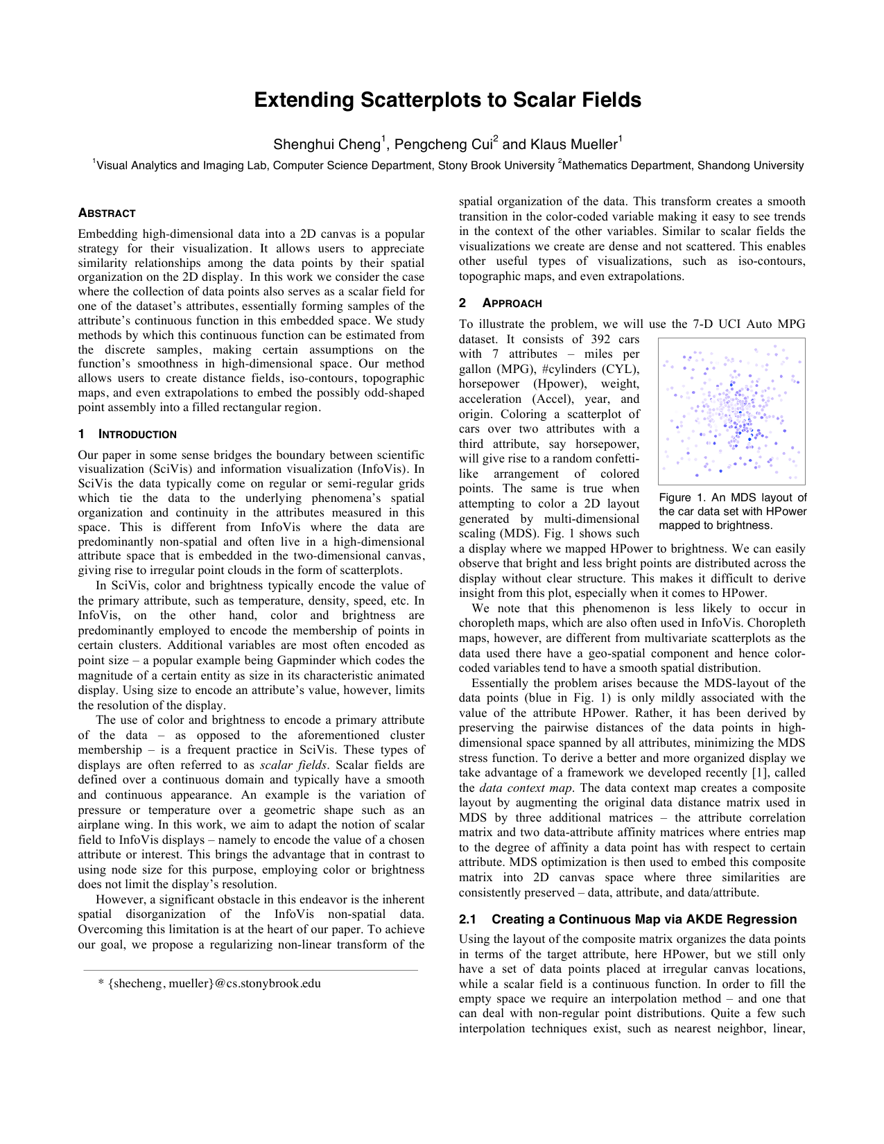
To illustrate the problem, we will use the 7-D UCI Auto MPG dataset. It consists of 392 cars with 7 attributes -miles per gallon (MPG), #cylinders (CYL), horsepower (Hpower), weight, acceleration (Accel), year, and origin. Coloring a scatterplot of cars over two attributes with a third attribute, say horsepower, will give rise to a random confettilike arrangement of colored points. The same is true when attempting to color a 2D layout generated by multi-dimensional scaling (MDS). Fig. 1 shows such a display where we mapped HPower to brightness. We can easily observe that bright and less bright points are distributed across the display without clear structure. This makes it difficult to derive insight from this plot, especially when it comes to HPower.
We note that this phenomenon is less likely to occur in choropleth maps, which are also often used in InfoVis. Choropleth maps, however, are different from multivariate scatterplots as the data used there have a geo-spatial component and hence colorcoded variables tend to have a smooth spatial distribution.
Essentially the problem arises because the MDS-layout of the data points (blue in Fig. 1) is only mildly associated with the value of the attribute HPower. Rather, it has been derived by preserving the pairwise distances of the data points in highdimensional space spanned by all attributes, minimizing the MDS stress function. To derive a better and more organized display we take advantage of a framework we developed recently [1], called the data context map. The data context map creates a composite layout by augmenting the original data distance matrix used in MDS by three additional matrices -the attribute correlation matrix and two data-attribute affinity matrices where entries map to the degree of affinity a data point has with respect to certain attribute. MDS optimization is then used to embed this composite matrix into 2D canvas space where three similarities are consistently preserved -data, attribute, and data/attribute.
Using the layout of the composite matrix organizes the data points in terms of the target attribute, here HPower, but we still only have a set of data points placed at irregular canvas locations, while a scalar field is a continuous function. In order to fill the empty space we require an interpolation method -and one that can deal with non-regular point distributions. Quite a few such interpolation techniques exist, such as nearest neighbor, linear, * {shecheng, mueller}@cs.stonybrook.edu natural neighbor, etc. We
📸 Image Gallery