t-viSNE: Interactive Assessment and Interpretation of t-SNE Projections
t-Distributed Stochastic Neighbor Embedding (t-SNE) for the visualization of multidimensional data has proven to be a popular approach, with successful applications in a wide range of domains. Despite their usefulness, t-SNE projections can be hard t…
Authors: Angelos Chatzimparmpas, Rafael M. Martins, Andreas Kerren
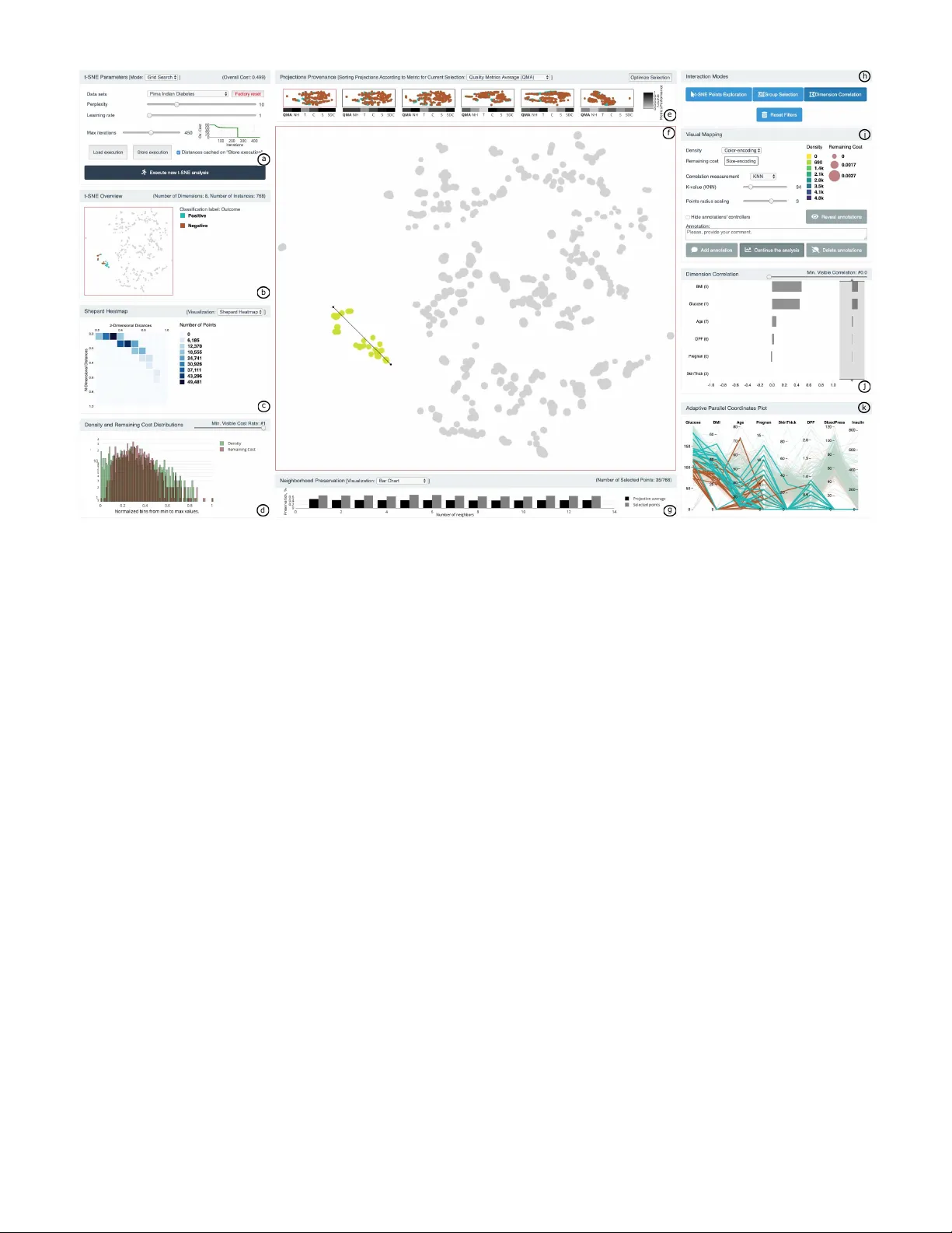
IEEE TRANSACTIONS ON VISU ALIZA TION AND COMPUTER GRAPHICS, V OL. XX, NO. X, JUL Y 2020 1 t-viSNE: Interactiv e Assessment and Inter pretation of t-SNE Projections Angelos Chatzimpar mpas, Student Member , IEEE, Raf ael M. Mar tins , Member , IEEE Computer Society , and Andreas K erren, Senior Member , IEEE Abstract —t-Distributed Stochastic Neighbor Embedding (t-SNE) f or the visualization of multidimensional data has proven to be a popular approach, with successful applications in a wide range of domains. Despite their usefulness , t-SNE projections can be hard to interpret or even misleading, which hurts the trustwor thiness of the results. Understanding the details of t-SNE itself and the reasons behind specific patterns in its output may be a daunting task, especially f or non-exper ts in dimensionality reduction. In this work, we present t-viSNE, an interactiv e tool for the visual e xploration of t-SNE projections that enables analysts to inspect diff erent aspects of their accuracy and meaning, such as the eff ects of hyper-parameters , distance and neighborhood preser vation, densities and costs of specific neighborhoods, and the correlations between dimensions and visual patterns. W e propose a coherent, accessible, and well-integrated collection of diff erent views f or the visualization of t-SNE projections. The applicability and usability of t-viSNE are demonstrated through h ypothetical usage scenar ios with real data sets. Finally , we present the results of a user study where the tool’ s effectiv eness was e valuated. By bringing to light information that would normally be lost after r unning t-SNE, we hope to suppor t analysts in using t-SNE and making its results better understandable . Index T erms —Inter pretable t-SNE, dimensionality reduction, high-dimensional data, explainab le machine lear ning, visualization. ✦ 1 I N T R O D U C T I O N D I M E N S I O NA L I T Y Reduction (DR) techniques are an impor- tant part of the toolbox of high-dimensional data analysis, with its initial techniques such as Principal Component Analysis (PCA) [1] and Multidimensional Scaling (MDS) [2] being several decades old no w . The problem that DR tries to solve is, in general, to find a low-dimensional representation of a high-dimensional data set that retains—as much as possible—its original structure . When used for visualization, the output is set to two or three dimensions, and the results are commonly visualized with scat- terplots, where similar objects are modeled by nearby points, and dissimilar ones by distant points. Linear DR methods , such as PCA, are easier to understand and to explain, since the remaining axes are linear combinations of the original dimensions, which establishes a direct relationship between the low-dimensional and the high-dimensional data set. When the specific constraints of being simple and easily explain- able are abrogated, other more intricate non-linear DR (or mani- fold learning ) methods can be used in order to capture much more complex high-dimensional patterns [3]. In general, non-linear DR methods opt to maintain local structures in detriment of global ones, i.e., their algorithms f avor the optimization of neighborhoods of points and mostly disre gard large distances. Although non- linear DR methods hav e also been around for quite some time (e.g., Sammon Mapping [4]), they have gained popularity in the past few years—due to increasingly better performance—with techniques such as Isomap [5], LLE [6], or LAMP [7]; a fe w comparativ e revie w papers on general DR exist already , see the surve ys [8] or [9]. This popularity has reached its peak after • Angelos Chatzimparmpas, Rafael M. Martins, and Andreas K erren ar e with the Department of Computer Science and Media T echnology , Linnaeus University , V ¨ axj ¨ o 35195, Sweden. E-mail: { ang elos.chatzimparmpas,rafael.martins,andr eas.kerren } @lnu.se . Manuscript received October XX, 2019; re vised F ebruary XX, 2020. the publication of t-distributed Stochastic Neighbor Embedding (t-SNE) [10]. Through a series of complex transformations and fine-tuned optimization procedures (cf. Section 3), t-SNE usually manages to create low-dimensional representations that capture complex patterns from the high-dimensional space v ery accurately , showing them as well-separated clusters of points. It has been used successfully in many different domains such as single-cell mass cytometry [11], natural language processing [12], and cancer analysis [13]. t-SNE’ s inherent comple xity , howe ver , has also raised con- cerns regarding the trustworthiness of the results and the difficulty in interpreting them. W attenberg et al. [14] demonstrated sev eral important pitfalls of t-SNE, such as (i) the highly-complicated relationship between input parameters and visualization, (ii) the apparent irrelev ance of the sizes (or density) of high-dimensional clusters, (iii) the disregard for the distance between clusters, (iv) the appearance of clusters ev en when the input is random, and (v) the dif ficulty in assessing and (vi) interpreting shapes. Although they also include advices and guidelines for using t- SNE effectiv ely , the examples use simple and carefully-engineered artificial data sets, for which the original appearance is clear . Therefore, one question remains open: how to av oid such pitfalls with real-world high-dimensional data, possibly in the thousands of dimensions, when little or no previous knowledge is av ailable? Inspired by the work of W attenberg et al. [14] and the existing visualization literature on interpreting and assessing DR meth- ods [15], [16], we present t-viSNE, a tool designed to support the interactiv e exploration of t-SNE projections (an extension to our previous poster abstract [17]). In contrast to other , more general approaches, t-viSNE was designed with the specific problems related to the in vestigation of t-SNE projections in mind, bringing to light some of the hidden internal workings of the algorithm which, when visualized, may provide important insights about the high-dimensional data set under analysis. Our proposed solution © 2020 IEEE. This is the author’s version of the article that has been published in IEEE T ransactions on V isualization and Computer Graphics. The final version of this recor d is available at: 10.1109/TVCG.2020.2986996 IEEE TRANSACTIONS ON VISU ALIZA TION AND COMPUTER GRAPHICS, V OL. XX, NO. X, JUL Y 2020 2 is composed of a set of coordinated vie ws that work together in order to fulfill four main goals: (G1) facilitate the choice of hyper-parameters through visual exploration and the use of quality metrics; (G2) provide a quick overview of the accuracy of the projection, to support the decision of either moving forward with the analysis or repeating the process of hyper-parameter exploration; (G3) provide the means to in vestigate quality further, differentiating between the trustworthiness of different regions of the projection; and (G4) allow the interpr etation of different visible patterns of the projection in terms of the original data set’ s dimensions. The implemented views are a mix of adapted and improv ed classic techniques (e.g., our Shepard Heatmap and Adaptiv e Parallel Coordinates Plot (PCP)), new proposals (e.g., the Di- mension Correlation view), and standard visual mappings with information that is usually hidden or lost after the projection is created (e.g., Density and Remaining Cost views). They were created in a careful design process that aimed to bring forward a selection of visualization techniques, combined and put together as a coherent whole in order to support—as much as possible—an accessible and usable analysis workflo w with t-SNE. T o the best of our kno wledge, t-viSNE is the first interactive visualization tool designed with the goal of alleviating the specific shortcomings of t- SNE and supporting, at the same time and in a coherent and usable way , the assessment of quality and the interpretation of patterns in t-SNE projections. In summary , our contributions consist of • a selection of different views, interaction techniques, and visual mappings designed to support the interpretation and assessment of t-SNE projections; • their implementation in a carefully-designed system geared to wards supporting analysts in o vercoming well- documented difficulties of working with t-SNE; and • a discussion on the design and the outcomes of a user study that showed promising results. Although our proposed solution is inspired by the work of W at- tenberg et al. [14] and touches on most of the points raised by the authors, not all of them are fully covered by t-viSNE. More specifically , t-viSNE addresses points (ii), (iii), (v), and (vi) described pre viously , partially co vers (i), and leaves point (iv) for future work, i.e., we only omit the inv estigation on how the formation of clusters might erroneously con vey messages to the users ev en when the input is random. Thus, we intend this work to be a comprehensiv e proposal of possible solutions to the problem of opening t-SNE’ s black box, and to provide very important and relev ant steps towards that final goal. The rest of this paper is organized as follows. In the next two sections, we discuss literature that is related to visual, interactive assessment and interpretation of t-SNE projections as well as the necessary background information on how the t-SNE algorithm works. Section 4 presents our visualization approach including the various features of t-viSNE in the three categories: overvie w , quality , and dimensions. W e then demonstrate the effecti veness of t-viSNE by describing two use cases with real data in Section 5. Thereafter in Section 6, we discuss the usability and applicability of t-viSNE by reporting the results of a user study . Section 7 discusses our design choices, limitations, and possible future work. Finally , Section 8 concludes our paper . 2 R E L A T E D W O R K A DR method is an algorithm that pr ojects a high-dimensional data set to a lo w-dimensional representation, preserving the structure of the original data as much as possible. Most of these algorithms hav e some (or many) hyper-parameters that may considerably affect their results, but setting them correctly is not a trivial task. In Subsection 2.1, we briefly describe techniques that try to solve this problem, and discuss the differences to our tool’ s functionality . The resulting projection is usually visualized with scatterplots, which support tasks such as finding groups of similar points, correlations, and outliers [16]. Howe ver , a scatterplot is simply the first step in analyzing a high-dimensional data set through a projection: questions regarding the quality of the results (see Subsection 2.2) and how to interpret them (see Subsection 2.3) are pervasi ve in the literature on the subject. A few other tools hav e been proposed throughout the years that incorporate these techniques to deal with the problem of supporting the exploration of multidimensional data with DR. In Subsection 2.4, we discuss their goals and trade-offs, and compare them with t-viSNE. Additionally , a summary of the tools discussed in this sec- tion and a feature comparison with t-viSNE is presented in T able 1. A tick indicates that the tool has the corresponding features/capabilities, while a tick in parentheses means the tool offers implicit support (i.e., it could be done manually , in an ad hoc manner , but is not explicitly supported). The table does not include works that do not contain a concrete visualization tool as their research contribution, as in Schreck et al. [18], for instance. Furthermore, we excluded the works which are not generalizable and focus on specific domain applications such as [19], [20]. T ABLE 1: Feature comparison of t-viSNE [21] with other related tools from the literature. The last column indicates if the tool (T) and/or its source code (SC) are av ailable online (last checked: January 15, 2020). Tool Features/Capab i lities Overview Quality Dimensions Multip le DR Algor. Support t- SNE Visual Param. Expl. Global Quality Assess. Local Quality Assess. Rank Dim . Interact. Shape Analysis t-viSNE ✓ ✓ ✓ ✓ ✓ ✓ T +SC Clustervision [51] ✓ ✓ ( ✓ ) ( ✓ ) ✓ T VisCoDeR [22] ✓ ✓ ✓ ✓ T Clustrophile 2 [23] ✓ ✓ ( ✓ ) ( ✓ ) AxiSketcher [47] ✓ ✓ ✓ GEP [63] ✓ ✓ ( ✓ ) T+SC ccPCA [ 44] ✓ ✓ T+SC DimRea der [ 45] ✓ ( ✓ ) SC Coimbra et al. [42] ✓ ✓ ✓ ✓ T+SC Praxis [46] ✓ ( ✓ ) ✓ FocusChanger [50 ] ✓ ✓ Probing Proj. [36] ✓ ✓ T+SC ProxiLens [34] ✓ Stress Maps [29] ✓ Availab le 2.1 Hyper -parameter Exploration V isCoDeR [22] supports the comparison between multiple projec- tions generated by different DR techniques and parameter settings, similarly to our initial parameter exploration, using a scatterplot view with an on-top heatmap visualization for evaluating the quality of these projections. In contrast to t-viSNE, it does not support further exploratory visual analysis tasks after the layout is selected, such as optimizing the hyper -parameters for specific user selections. Clustrophile 2 [23] contains a Clustering T our feature to partially assist users in immediately exploring the space of potential clustering results by visualizing previous and current solution states, and providing choices of modalities by which the © 2020 IEEE. This is the author’s version of the article that has been published in IEEE T ransactions on V isualization and Computer Graphics. The final version of this recor d is available at: 10.1109/TVCG.2020.2986996 IEEE TRANSACTIONS ON VISU ALIZA TION AND COMPUTER GRAPHICS, V OL. XX, NO. X, JUL Y 2020 3 user can restrain how parameters are updated. These features help with the in vestigation of the quality of different clustering results (see the subsection below) in relation to the users’ analytical tasks. Ho wev er, t-viSNE supports the visual exploration of a predetermined space of solutions, which allows users to optimize sublocations and highlight these patterns with new projections. 2.2 Quality Assessment One way to obtain an indication of a projection’ s quality is to compute a single scalar v alue, equiv alent to a final scor e . Examples are Normalized Stress [7], T rustworthiness and Con- tinuity [24], and Distance Consistency (DSC) [25]. More recently , ClustMe [26] was proposed as a perception-based measure that ranks scatterplots based on cluster-related patterns. While this might be useful for quick overvie ws or automatic selection of projections, a single score fails to capture more intricate details, such as wher e and why a projection is good or bad [27]. In contrast, local measures such as the pr ojection precision score (pps) [18] describe the quality for each indi vidual point of the projection, which can then be visualized as an extra layer on top of the scatterplot itself. These measures usually focus on the preserv ation of neighborhoods [28], [29], [30] or distances [27], [31], [32]. As an example, the set differ ence from Martins et al. [33] uses the Jaccard set-distance between the two sets of neighbors of a point in lo w- and high-dimensional space in order to compute a measure of Neighborhood Preservation. W e hav e chosen to adopt it in our work, in contrast to others, because of its intuitive interpretation, simple computation, and straightforward adaptation for displaying the preservation of neighborhoods of different scales. Quality measures can also be used in interactiv e explorations to expose errors on demand and direct the user’ s further explo- rations [34]. Liu et al. [35] use a combination of hierarchical clustering and different local measures to guide the user in manipulating the projection and testing hypotheses about the data. Probing Projections [36] simulates a correction of the points’ posi- tions according to a reference point, showing ho w a more accurate projection would look like. Fernstad et al. [37] use combinations of quality measures to determine the most interesting dimensions of the data and guide user exploration. t-viSNE is similar to these works in its use of measures to guide the user’ s exploration, but we use measures and mappings that are either specific to t-SNE’ s algorithm or customized to be more useful in this scenario. For more details about the assessment of quality in projections, we refer the reader to Nonato and Aupetit’ s recent survey [16]. 2.3 Interpretation of Pr ojections Some attempts to enrich scatterplots with automatically-derived statistical descriptions of patterns [38], [39], [40] have sho wn that static mappings may be useful in simple scenarios, but the complex relations between low- and high-dimensional space in non-linear projections cannot be well represented. In such cases, interactiv e visual interfaces are necessary , as noted by Sacha et al. [15] in their survey on interaction techniques for DR. Inter - activ e solutions for specific domains such as text [19], [20] and images [7], [41] use inherent characteristics of the data in order to explain layouts, ho wever , they are not easily generalizable to other domains. In their tool, Coimbra et al. [42] support interacti ve exploration of 3-D projections using adapted biplots and different widgets for viewpoint selection. Our tool is similar to theirs from the perspective of providing a collection of interconnected views for projection exploration, b ut they focus on projection- agnostic 3-D scatterplots, and the widgets ha ve dif ferent goals. Probing Projections [36] is another such interactive system that supports both explaining and assessing projections, but limited to MDS [43]. Groups of points can be compared in terms of the data set’ s dimensions, and a heatmap of the distribution of a selected dimension can be overlaid on the visualization, but there is no special prioritization of dimensions to deal with very high- dimensional data; the user must simply c ycle through all of them in order to find the most relev ant one. Fujiwara et al. [44] proposed the contrasting clusters in PCA (ccPCA) method to find which dimensions contributed more to the formation of a selected cluster and why it differs from the rest of the dataset, based on information on separation and internal vs. external variability . W e have similar goals, but approach them with different methods. For exploring clusters and selections in general, we use PCA to filter and order a local PCP plot; this could be easily adapted to use ccPCA instead as an underlying method for choosing which dimensions to filter and how to re-order the axes, without affecting the ov erall pro- posed analytical flow of the tool. On the other hand, ccPCA does not deal with the analysis of shapes, which we support with our proposed Dimension Corr elation . Other recent approaches include DimReader [45], where the authors create so-called generalized axes for non-linear DR methods, but besides explaining a single dimension at a time, it is currently unclear how exactly it can be used in an interactiv e exploration scenario; and Praxis [46], with two methods— backwar d and forwar d projection—but it requires fast out-of-sample extensions which are not av ailable for the original t-SNE. Most similarly to one of our proposed interactions (the Di- mension Corr elation , Subsection 4.4), in AxiSketcher [47] (and its prior version InterAxis [48]) the user can draw a polyline in the scatterplot to identify a shape, which results in new non-linear high-dimensional axes to match the user’ s intentions. Since the resulting dimension contributions to the axes are not uniform, it is not possible to represent them using simple means such as bar charts. In our Dimension Corr elation tool, the user also draws a polyline to identify a shape, but our intention is exactly the oppo- site of AxiSketcher: we want to capture dimension contrib utions in an easy and accessible way . For this, we project low-dimensional points into the line (not high-dimensional ones, as in AxiSketcher), and we compute the dimension contributions in a different way , using Spearman’ s rank correlation. In summary , although there is a superficial similarity between the two techniques regarding how the user interacts with the scatterplot, their goals and their inner workings are quite different. Since t-viSNE adopts an approach of combining many different coordinated views, it is important for the Dimension Corr elation to maintain—as much as possible— the users’ mental map of the projection, and to give simple and straightforward interpretations of the patterns they see. 2.4 Comparison with Other T ools Other than the ones discussed so far , some interactive tools have been designed with either specific DR methods in mind, such as SIRIUS [49], and F ocusChanger [50], or for specific domains, such as Cytosplore [11]. t-SNE can also be used to explore and judge dif ferent clustering partitions of the same data set, as in Clustervision [51]. SIRIUS [49] focuses on the concurrent exploration of sim- ilarity relationships between instances and between dimensions, © 2020 IEEE. This is the author’s version of the article that has been published in IEEE T ransactions on V isualization and Computer Graphics. The final version of this recor d is available at: 10.1109/TVCG.2020.2986996 IEEE TRANSACTIONS ON VISU ALIZA TION AND COMPUTER GRAPHICS, V OL. XX, NO. X, JUL Y 2020 4 analyzing their relationship and providing interaction techniques via a dual visualization approach, with two coordinated side-by- side scatterplots. In t-viSNE, we focus on bringing forward hidden information about the DR algorithm that is usually lost, with all the interactions occurring in a single main scatterplot view (and some additional auxiliary views). One of our goals is to also support the user in testing the quality of the algorithm to increase its trustworthiness, a task that is not supported by SIRIUS. FocusChanger [50] empowers users to perform local analyses by setting Points of Interest (POIs) in a linear projection, which is then updated to enhance the representation of the selected POIs. When hovering over specific points, the information of true neighborhood of other points is mapped to the saturation of the color . This allows for a simple mechanism of quality assessment, but hurts the possibility of using color for other mappings and requires pointwise interaction. The used projections are linear and, thus, potentially not as representati ve and useful as t-SNE. Similar to Andromeda, it relies on the possibility of quickly updating them, which might not be currently feasible with t-SNE. Cytosplore [11] is an example of tools that use t-SNE for visual data e xploration within a specific domain: single-cell analysis with mass cytometry data. Apart from showing a t-SNE projection of the data, Cytosplore is also supported by a domain-specific clustering technique which serves as the base for the rest of the provided visualizations, but is not generalizable to other domains. Clustervision [51] is a visualization tool used to test multiple batches of a varying number of clusters and allows the users to pick the best partitioning according to their task. Then, the di- mensions are ordered according to a cluster separation importance ranking. As a result, the interpretation and assessment of the final results are intrinsically tied to the choice of clustering algorithm, which is an external technique that is (in general) not related to the DR itself. Thus, the quality of the results is tied to the quality of the chosen clustering algorithm. W ith t-viSNE it is also possible to explore the results of a clustering technique by , for example, mapping them to labels, then using the labels as regions of interest during the interactiv e exploration of the data. Howe ver , the labels do not influence the results of t-viSNE, whether they exist or not, since we did not intend to tie the quality of our results to other external (and independent) techniques. 3 O V E RV I E W O F T - S N E All the details about t-SNE’ s algorithm hav e been exhaustiv ely described since its first publication (see, e.g., [52], [53], [54]). Here, we giv e a quick ov erview of the general steps of the algo- rithm and focus mostly on the specific details that are important for understanding the features of our tool. The input to t-SNE is an n × N data matrix X , composed of a set of n instances x i (rows) in N dimensions (columns). As the first step, pairwise distances between instances are transformed into probability distributions that represent neighborhoods in the following way . For e very pair of instances ( x i , x j ) with 1 ≤ i , j ≤ n , a probability p i j is computed as p i j = p j | i + p i | j 2 n , p j | i = ex p ( −∥ x i − x j ∥ 2 / 2 σ 2 i ) ∑ k = l ex p ( −∥ x k − x l ∥ 2 / 2 σ 2 i ) . (1) Equation (1) can be interpreted as the pr obability that two instances x i and x j would pick each other as close neighbors . It is roughly equiv alent to centering a multiv ariate Gaussian around x i and setting p j | i to the Gaussian-transformed value of its distance to x j , then the same but centered on x j , and finally combining both. That translates to high probabilities for near neighbors and very small probabilities for farther ones. One of the most important things to notice from Equation 1, howe ver , is that the variance of the Gaussian, i.e., σ i , is different for each x i : that means that the bandwidth of the Gaussian changes for each high-dimensional instance, in order to capture the variations in density for different high-dimensional neighborhoods. This value is found iteratively by trial-and-error, using binary search, until a user-defined perplexity is reached, with P er p ( i ) = 2 H ( i ) and H ( i ) = − ∑ j p j | i l og 2 p j | i . Considering P as the joint distribution including all pairwise probabilities computed according to Equation 1, the goal of t-SNE is, then, to find another probability distribution Q that faithfully represents P in low-dimensional spaces, usually in 2-D or 3-D (to allow for their straightforward visualization). Each pair of lo w- dimensional points ( y i , y j ) is also modeled as a probability , no w called q i j , as q i j = ( 1 + ∥ y i − y j ∥ 2 ) − 1 ∑ k = l ( 1 + ∥ y k − y l ∥ 2 ) − 1 . (2) Instead of using Gaussians again, a Student’ s t-distribution with one degree of freedom is used for Q . Notice that, as opposed to P , the distribution of Q is not parameterized with a variable neighborhood density (i.e., there is no σ i ). This means that, potentially , neighborhoods with very different densities in the original high-dimensional space may be mapped into areas of equiv alent size in the low-dimensional representation. The search for a Q that faithfully represents P in a low- dimensional space is done by optimizing a cost function ( C ) giv en by the Kullback-Leibler ( K L ) diver gence between the two distributions, C = K L ( P ∥ Q ) = ∑ i K L ( P i ∥ Q i ) , K L ( P i ∥ Q i ) = ∑ j p i j l og p i j q i j , (3) which is performed with gradient descent for a user-specified number of iterations. In each iteration, every point y i is adjusted tow ards the direction of the largest decrease in its associated cost K L ( P i ∥ Q i ) , i.e., the Kullback-Leibler Diver gence ( K LD ) between the low-dimensional neighborhood of y i and the high-dimensional neighborhood of x i . Computing this cost inv olves comparing y i with all other points, which results in a complexity of O ( N 2 ) . The final remaining cost C after the optimization is, then, a sum of all the remaining costs K L ( P i ∥ Q i ) . It is important to notice that the original t-SNE algorithm has been updated and accelerated in many different ways throughout the years, most famously by the original author [52], but also by other researchers using techniques such as approximations [53] and parallel computing [54]. These newer versions giv e mostly accurate results, but are not completely exact. Please refer to Subsection 7.2 for a discussion on why we chose to use the Barnes–Hut t-SNE algorithm in this paper [52]. 4 T - V I S N E : A V I S UA L I N S P E C T O R O F T - S N E Most of the related works described in Section 2 deal with the problem of assessing and interpreting DR in general, and aim to be applicable to a wide range of different scenarios, providing solutions that ov erlook the specific shortcomings of each DR method. While this approach has its merits, a gap remains regarding the treatment of method-specific problems that might lead to more directly-applicable results. Howe ver , very few © 2020 IEEE. This is the author’s version of the article that has been published in IEEE T ransactions on V isualization and Computer Graphics. The final version of this recor d is available at: 10.1109/TVCG.2020.2986996 IEEE TRANSACTIONS ON VISU ALIZA TION AND COMPUTER GRAPHICS, V OL. XX, NO. X, JUL Y 2020 5 d a b c h Preser vatio n, % j k g e f Metri cs Per formanc e Fig. 1: V isual inspection of t-SNE results with t-viSNE: (a) a panel for uploading data sets, choosing between two execution modes (grid search or a single set of parameters), and storing new (or loading previous) executions; (b) overvie w of the results with data-specific labels encoded with categorical colors; (c) the Shepard Heatmap of all pairwise distances; (d) the histogram with the Density and Remaining Cost distributions; (e) list of av ailable projections, ranked by quality; (f) the main scatterplot view representing the Density of neighborhoods in the original high-dimensional space and the Remaining Cost of each point; (g) the Neighborhood Preservation bar chart/line plot; (h) control elements for the different interaction modes of the tool; (i) the visual mapping panel with a variety of options for the users such as an annotation tool for saving notes for multi-session analyses; (j) the Dimension Correlation bar chart visualizing the correlations between the data dimensions; and (k) the Adaptiv e PCP plot representing the most important dimensions. single DR methods ha ve enough widespread acceptance to w arrant customized treatments (with the exception of PCA and MDS, for example). Nowadays, arguably , the situation has changed: t-SNE is almost a standard DR method for both analysts and researchers. Due to this, it is our understanding that a set of methods that is specifically designed to meet t-SNE’ s shortcomings deserves its place among the current body of work in the interpretation and assessment of DR methods, and its potentials are large enough to deserve their own treatment. In this section we describe t-viSNE, a web-based system that implements an assortment of views and interaction tools that bring to light many facets of a t-SNE projection which are usually hidden behind its black box. W e aim to enhance the trust into and interpretability of t-SNE through visualization and exploration of the model, the data, and the hyper-parameters. An overall picture of the interface is shown in Figure 1, and each of its different views is described below , divided into our four design goals: Hyper-par ameter Exploration (G1) , Overview (G2), Quality (G3), and Dimensions (G4). Further discussions on the design choices behind some of the views can be found in Subsection 7.1. 4.1 Goal 1: Hyper -parameter Exploration Significantly-different t-SNE projections can be generated from the same data set, due to its well-kno wn sensitivity to hyper - parameter settings [14]. W e propose to support users in finding a good t-SNE projection for their data by using visual exploration, as follows. A Grid Searc h mode (Figure 1(a)) initiates a systematic parameter search that computes 500 projections by v arying the parameters perple xity , learning r ate , and max iter ations . From this pool of 500 projections, 25 representati ve examples are singled out and shown to the user—in a matrix of thumbnails depicted in Figure 2—as suggestions of possible projections of the data. In order to choose the representativ es, we partition the pool of 500 projections into 25 clusters (with K-Medoids [55]), using Procrustes distance [56] as the dissimilarity measure. The medoids of the 25 resulting clusters are used as representativ es. This whole process is transparent to the user and happens in the backend; only the representatives are sho wn. W e giv e e xtra support to the user by providing the results of 5 quality measures for each representativ e projection: neighborhood hit (NH), trustworthiness (T), continuity (C), normalized stress (S), and Shepard diagram correlation (SDC), accompanied by the quality metrics average (QMA). They are shown as a grayscale heatmap under each cell of the thumbnail matrix (Figure 2). For more details on the quality measures, please refer to [9]. It is important to clarify , ho wever , that these quality measures are of fered only as a support for the visual analysis. The main goal here is not to show the 25 best projections, b ut the most diverse ones; it is then the task of users— through visual exploration and by matching their own personal preferences—to choose the one that looks more promising. © 2020 IEEE. This is the author’s version of the article that has been published in IEEE T ransactions on V isualization and Computer Graphics. The final version of this recor d is available at: 10.1109/TVCG.2020.2986996 IEEE TRANSACTIONS ON VISU ALIZA TION AND COMPUTER GRAPHICS, V OL. XX, NO. X, JUL Y 2020 6 Fig. 2: Hyper-parameter exploration (presented in a dialog at the beginning of an analytical session), with 25 representativ e projections from a pool of 500 alternati ves obtained through a grid search. Fi ve quality metrics, plus their Quality Metrics A verage (QMA), are also displayed to support the visual analysis. The thumbnails are sorted according to the QMA and ordered row-wise from top to bottom. The currently-selected projection is indicated by a red box (top row , third column). After choosing a projection, users will proceed with the visual analysis using all the functionalities described in the next sections. Howe ver , the hyper-parameter exploration does not necessarily stop here. The top 6 representativ es (according to a user-selected quality measure) are still shown at the top of the main view (Figure 1(e)), and the projection can be switched at any time if the user is not satisfied with the initial choice. W e also provide the mechanism for a selection-based ranking of the representatives. During the exploration of the projection, if the user finds a certain pattern of interest (i.e., cluster, shape, etc.), one possible question might be whether this specific pattern is better visible or better represented in another projection. After selecting these points, the list of top representatives can be ranked again to contain the projections with the best quality regarding the selection (as opposed to the best global quality , which is the default). The way this “selection-based quality” is computed is by adapting the global quality measures we used, taking advantage of the fact that they all work by aggregating a measure-specific quality computation ov er all the points of the projection. In the case of the selection-based quality , we aggregate only ov er the selected points to reach the final value of the quality measure, which is then used to re-rank the representativ es. 4.2 Goal 2: Overview The main view of the tool (Figure 1(f)) presents the t-SNE results as an interactive scatterplot, with specific mappings on the points’ colors and sizes (see Subsection 4.3 for details). There are four Interaction Modes (Figure 1(h)) for this vie w , as described next. The first (and default) mode— t-SNE P oints Ex- ploration —acti vates panning, zooming, and hov ering, supporting the user to focus on indi vidual patterns of the projection, and to inv estigate specific points’ dimensions. The second mode— Gr oup Selection —provides a lasso selection tool that triggers updates in other views, such as the Neighborhood Preserv ation view (Subsection 4.3) and the Adaptiv e PCP (Subsection 4.4). The third option— Dimension Corr elation —provides a tool for the user to check the hypothesis that a visual pattern, as observed, is strongly correlated to a pattern in the high-dimensional space (Subsection 4.4). The final mode— Reset F ilters —removes ev ery filter applied with the previously-described interaction modes. T o complement the main view , the Overview (Figure 1(b)) shows the static t-SNE projection and serves as a contextual anchor that is independent of the interactions and/or filters applied to the main view . Data-specific labels (when those exist) are sho wn using a categorical colormap, along with simple statistics about the data set. 4.3 Goal 3: Quality Before the users mov e on with a more detailed interpretation of the patterns that are visible in the scatterplot resulting from t- SNE’ s projection, it is important that they trust what they see. W e approach the in vestigation of quality both globally , with simplified and aggregated views for the entire projection, and locally , so that the users can check if specific visible patterns are indeed present in the original space of the data set. Shepard Heatmap A Shepard Diagram [57] is a common way of assessing the accuracy of a visualization produced by a projection method. It consists of a scatterplot where each point represents a pair of instances from the data set. The value of the y -axis indicates their distance in the N -dimensional ( N -D) space, and the x -axis their 2-D distance. Both axes are scaled between 0 . 0 (minimum distance) and 1 . 0 (maximum distance), with the origin located on the top-left. For large data sets, howe ver , such a scatterplot may become hard to read due to the very large number of points (in the order of n 2 ). T o avoid this clutter problem and increase the readability of the Shepard Diagram for large data sets, we propose the Shepard Heatmap (Figure 1(c)), which is an aggregated version of the Shepard Diagram, with the information of the number of points in each cell mapped to a single-hue colormap. The main goal of the Shepard Heatmap is to of fer a broad, simplified overvie w of the accuracy of the projection in terms of distance preserv ation: cells close to the main diagonal of the heatmap indicate that the respective pairs of instances hav e been represented in the 2-D space with distances that are comparable to their original N -D distances. Although it is well-known that t- SNE’ s goal is not to preserve distances [10], but neighborhoods, the Shepard Heatmap still provides useful information to the analyst: if the cell values are closer to the y -axis than to the x -axis, then a large part of the data has been compressed , i.e., a diverse range of distances from the N -D space ha ve been represented with small distances in 2-D. The opposite scenario (cell values being closer to x than y ) indicates that a small range of N -D distances © 2020 IEEE. This is the author’s version of the article that has been published in IEEE T ransactions on V isualization and Computer Graphics. The final version of this recor d is available at: 10.1109/TVCG.2020.2986996 IEEE TRANSACTIONS ON VISU ALIZA TION AND COMPUTER GRAPHICS, V OL. XX, NO. X, JUL Y 2020 7 (a) PCA (b) t - SNE (c) t - viSNE 2 2 3 3 1 1 low high Density Fig. 3: The importance of the visual mapping of Density , using three 5-D Gaussian clusters with varying standard deviations and slight overlap. (a) A simple linear projection using PCA shows the clusters’ varying density . (b) A t-SNE projection sho ws all clusters with roughly the same size. (c) t-viSNE accurately shows the densities of the clusters (color-encoded) and helps us identify , for example, that clusters 2 and 3 are separate. hav e been spr ead in a wide spectrum of distances in the 2-D visualization. V isual Mapping The V isual Mapping panel (Figure 1(i)) includes controls for mapping Density (1 / σ i ) and Remaining Cost ( K LD ( P i || Q i ) ) of each point to either color or size in the main view . These correspond to information extracted from the t-SNE algorithm itself, which would otherwise be hidden from the analyst. Their inspection, howev er , may prov e fruitful, as we describe next. As we discussed in Section 3, when t-SNE models the N -D space as probability distributions, each instance is assigned a different σ i that represents the Density of that instance’ s orig- inal neighborhood. Ho wever , during the projection to the lo w- dimensional representation (2- or 3-D), this information is usually lost, and neighborhoods with different densities appear to be very similar . Consider the simple example from Figure 3, where three 5-D Gaussian clusters (with varying densities) are projected into 2-D using PCA and t-SNE. The linear projection of PCA shows quite clearly that the clusters hav e different densities. The t-SNE projection, on the other hand, shows three clusters that are basi- cally identical. W e propose to recov er this lost density information by e xtracting the values of σ i from the t-SNE process and mapping them on top of the points (using a sequential colormap, by default). The actual mapping is done with σ − 2 i , so that higher densities (lower values of σ i ) are mapped to higher values. As an example of the practical consequences of such a mapping, the visualization of the different density profiles of clusters 2 and 3 in t-viSNE (Figure 3(c)) helps to identify that they are separate clusters and not a single large one, which could ha ve been an erroneous insight in case no extra information was available (as in Figure 3(b)). The second option of the V isual Mapping panel, the Remaining Cost , indicates (in the points’ sizes, by default) the final value of K LD ( P i ∥ Q i ) for each instance x i , i.e., the remaining cost for each instance after the last iteration of t-SNE’ s optimization procedure (see Section 3). It is common for the information of the overall remaining cost ( K LD ( P ∥ Q ) ) to be used as a direct judgment of the projection’ s quality . Ho wev er, this perspective is limited, because a lo w overall remaining cost does not mean that the entire projection is equally good (and vice-versa for a high overall remaining cost). This is related to the idea of local quality measures that has been moti vated and e xplored in different previous w ork (see Section 2), and shares the potential advantages of these measures. Hence, it allows the analyst to in vestigate which points (or groups of points) were harder to optimize according to t-SNE’ s cost function and, thus, affects the perception of the local trustworthiness of different areas of the projection. A simple example is shown in Figure 4, using the well-known Iris data set [58]. A group of points with high remaining cost can be found in the middle of the lar gest cluster in Figure 4(a). This cluster is, actually , a mix of two different species ( versicolor and vir ginica ), and the points with high remaining cost belong to the area where the two species are mixed, indicating instances where the 2-D mapping might not be as straightforward as the rest. The dimensions of the selected points are highlighted in Figure 4(b) using a PCP (see Subsection 4.4), confirming that these points are indeed characterized by dimension v alues that are relativ ely common to both species, which makes them harder to separate into isolated clusters. (b) Dimensions of selected points (c) Neighborhood Preservatio n of selected points (a) Point s wit h high remaining cost versicolo r virginica set osa Projection avera ge Selected points Selection high Number of neighbors Mixed labels Fig. 4: In vestigation of a group of points from the well-known Iris data set [58]. (a) The points’ sizes indicate that a region in-between the species versicolor and vir ginica has the highest Remaining Cost. (b) The points hav e similar dimension v alues, b ut are classified as different species. (c) Neighborhood Preservation starts high (for close neighbors), but steadily decreases. Neighborhood Preserv ation Since the proposal of non-linear DR methods, the idea of prioritizing the preservation of close neighborhoods instead of pairwise distances in projections has been accepted as a positiv e trade-off, especially in visualiza- tion scenarios. The t-SNE algorithm also follows this idea: by transforming the pairwise distances into probability distributions using Gaussians (cf. Section 3), it aims to preserve only the closest neighbors of each point, effecti vely ignoring farther ones. Due to this, the ability to inv estigate the extent to which such neighborhoods are preserved is one important piece of the puzzle that forms a full assessment of the accuracy of a t-SNE projection. W e present a Neighborhood Preservation plot (Figure 1(g)) that shows an ov erview of the preservation of neighborhoods of different sizes ( k ) in both the entire projection and the current selection, based on the Jaccard distance between sets: N P k = ∑ i 1 n · ν 2 k ( i ) ∩ ν N k ( i ) ν 2 k ( i ) ∪ ν N k ( i ) , (4) where ν 2 k ( i ) is the k -neighborhood of instance i in 2-D, ν N k ( i ) is the k -neighborhood of instance i in N -D, and n is the number of selected points (or the size of the data set, if nothing is selected). For each value of k , N P k yields the aver age pr eservation of neighborhoods of up to k points, centered at the n selected points (or for the entire projection, if nothing is selected). This is an aggregated and interacti ve adaptation of ideas introduced by , for example, Joia et al. [7] and Martins et al. [33]. The default visualization for the Neighborhood Preservation is a bar chart (as © 2020 IEEE. This is the author’s version of the article that has been published in IEEE T ransactions on V isualization and Computer Graphics. The final version of this recor d is available at: 10.1109/TVCG.2020.2986996 IEEE TRANSACTIONS ON VISU ALIZA TION AND COMPUTER GRAPHICS, V OL. XX, NO. X, JUL Y 2020 8 described below), but users ha ve two more options to visualize the same information using line plots (see Subsection 7.1 for a discussion and comparison). The black bars are always fixed, showing the average preser- vation for all points of the projection. For example, in Figure 4(c), the relatively tall black bars starting from the point k = 20 mean that, on average, neighborhoods of 20 points or more are well preserved. The same rationale applies to the gray-colored bars. Howe ver , their values change in connection with the lasso selection, so that they always sho w an up-to-date vie w of the Neighborhood Preservation centered at the selected group of points. This allows the analyst to compare them to the rest of the projection to get a relative assessment, which is important since there are no absolute rules as to how much preservation is good or bad; such insights depend on the scale of the data set and of each high-dimensional pattern. In Figure 4(c), for example, the tall gray-colored bars around k = 4 mean that, on av erage, neighborhoods of around 4 points are well preserved for the selected points . This is in contrast to the overall preservation, which starts lo w and grows slowly with k . Since the selected points are positioned at the border between the two species clusters, they hav e very close near neighbors (i.e., points which are located in- between species), but as the v alue of k grows, their neighborhoods become more mixed and, thus, less well-preserved. 4.4 Goal 4: Dimensions Having established trust in the visualization, the users then pro- ceed to identify and in vestigate the visible patterns from the projected data. One of the most common analytical tasks in any DR-based workflow is, for example, to identify clusters of similar points [16], with the goal of detecting patterns in the organization of the data in the high-dimensional space. Irregularly-shaped clusters are also of interest [14], which suggests that the points’ organization along a non-linear multidimensional axis might be relev ant. The problem of e xplaining the reasons why those clusters are formed is tackled by a number of t-viSNE views that are described next. Adaptive Parallel Coordinates Plot Our first proposal to support the task of interpreting patterns in a t-SNE projection is an Adaptive PCP [59], as shown in Figure 1(k). It highlights the dimensions of the points selected with the lasso tool, using a maximum of 8 axes at any time, to a void clutter . The shown axes (and their order) are, howe ver , not fixed, as is the usual case. Instead, they are adapted to the selection in the following way . First, a Principal Component Analysis (PCA) [1] is performed using only the selected points , but with all dimensions. That yields two results: (1) a set of eigen vectors that represent a ne w base that best explains the variance of the selected points, and (2) a set of eigenv alues that represent how much variance is explained by each eigen vector . Simulating a reduction of the dimensions of the selected points to 1-Dimensional space using PCA, we pick the eigen vector with the largest eigen value, i.e., the most representativ e one. This N -D vector can be seen as sequence w of N weights, one per original dimension, where the value of w j indicates the importance of dimension j in explaining the variance of the user-selected subset of the data. Finally , we sort w in descending order , then pick the dimensions that correspond to the first (up to) 8 values of the sorted w . These are the (up to) 8 dimensions shown in the PCP axes, in the same descending order (from left to right). 0.016% 0.817% -0.450% (a)%Points%%%%%%%user-drawn%path% (b)% Comparison% of % orderings % (c)%Dimension% Correlation% 7% 3% 4% 2% 1% 9% 8% 5% 6% 𝜌 % 7% 3% 4% 2% 1% 8% 5% 9% 6% 3% 4% 5%1% 2% 8% 6% 9% 7% 1% 6% 5% 9% 3% 4% 8% 2% 7% 4% 1% 2% 5% 9% 3% 6% 8% 7% Dim.%2% Dim.%3% Dim.%1% User % Dim.%2% Dim.%3% Dim.%1% Fig. 5: The Dimension Corr elation tool. (a) Nearby points are projected to a user-drawn path, creating a user-induced ordering. Here 7, 3, 4, and so on are data instance IDs. (b) The user-induced ordering is compared to dimension-specific orderings using a correlation measure. (c) Results are shown in the lengths of bars, ordered by the absolute value of the correlation (with highest on top). Note that if the same polyline is drawn by the user in the opposite direction over a pattern, then the signs of the correlations change but not their magnitude. Apart from the adaptive filtering and re-ordering of the axes, we maintained a rather standard visual presentation of the PCP plot, to make sure it is as easy and natural as possible for users to inspect it. The colors reflect the labels of the data with the same colors as in the overvie w (Subsection 4.2), when av ailable, and the rest of the instances of the data—which are not selected—are shown with high transparency . Each axis maps the entire range of each dimension, from bottom to top. A simple example is giv en in Figure 4(b), where we can see that the dimensions of the selected points roughly appear at the intersection between two species, versicolor (brown) and virginica (orange). Dimension Correlation Supporting the interpretation of clus- ters is definitely one important step towards interpreting t-SNE, but it does not cover the entire picture. As it has been noted by W attenberg et al. [14], t-SNE commonly generates visual patterns with different shapes, which may or may not faithfully represent the actual shapes of the original high-dimensional patterns. It is natural to expect that the user, upon seeing an oddly-shaped pattern, will come up with different hypotheses about why that shape exists, or at least will be curious to try to understand what exactly caused such a shape to appear . W e propose the Dimension Correlation tool, a no vel interactiv e tool to explore and interpret such shapes in a t-SNE projection. It is triggered by a user interaction that consists of drawing a polyline with the mouse (i.e., a sequence of connected line se gments), following the shape of the pattern detected by the user . After the polyline is finished, all points within a user-defined range ρ of the polyline are selected and “projected” onto the polyline, in the following way (cf. Figure 5): (1) we find the minimum distance d p i between each point i in the scatterplot to the polyline p , defined as the minimum distance from i to any segment of p ; (2) every point i such that d p i > ρ is discarded; and (3) for the remaining points, we find the point p i that is the projection of i into p , i.e., the projection of i into the segment of p that is closest to i . If we ignore the actual distances between the points p i ob- tained along the polyline, a user-defined or dering can be induced (or extracted) for the points i that were not discarded during the process (cf. Figure 5(b)). This is one possible way of modeling— in a simple and unambiguous way—the shape of the visual pattern perceived by the user . Based on this ordering, we can then in vestigate which dimensions are more correlated to the pattern, i.e., are more relev ant to explain its significance. For that, we first © 2020 IEEE. This is the author’s version of the article that has been published in IEEE T ransactions on V isualization and Computer Graphics. The final version of this recor d is available at: 10.1109/TVCG.2020.2986996 IEEE TRANSACTIONS ON VISU ALIZA TION AND COMPUTER GRAPHICS, V OL. XX, NO. X, JUL Y 2020 9 generate a set of dimension-specific orderings for the same points i that were projected onto the polyline, using the values of these points along each dimension for the ordering (cf. Figure 5(b)). For example, in a data set X , for the dimension-specific ordering of dimension j , the v alues X i , j will be used (for the selected points i ). The r elevance of each dimension is then defined as the absolute value of the correlation between its dimension-specific ordering and the user-defined ordering of the points i , which is equiv alent to the Spearman’ s rank correlation coefficient [60]. W e use the absolute v alue here, because the fact that the correlation is positiv e or negativ e is not critical. A strong negati ve correlation simply means that the pattern goes in the opposite direction of the one used when drawing the polyline. The results (i.e., relev ances of each dimension) are finally shown in an interactiv e horizontal bar chart (Figure 1(j)), where the dimensions are sorted from top to bottom according to rele- vance (with the most relev ant on the top). While the relev ance is computed using the absolute value of the correlation, we decided to show the original value in the bars (including negati ve correla- tions to the left of the central axis) to av oid possibly misleading the analyst. This is illustrated in Figure 5(c). The final component of the Dimension Correlation tool is the ability to explore the different dimensions by clicking on the bars, which will change the colormap of the main view to reflect the values of the points for that specific dimension. It is important to notice that the goal of the Dimension Corre- lation tool is not to dictate exactly which are the dimensions that cause the formation of a shape in a t-SNE projection. W e propose a way to suggest the most interesting dimensions according to a detected visual pattern, in order to help analysts to prioritize the dimensions they will inv estigate further . Mapping the values of specific dimensions on top of the points of the scatterplot (usually with colors) is a common way to try to find relationships between dimensions and patterns during the exploration of DR projections. W ithout any support, it is also usually a cumbersome activity for high-dimensional data sets, requiring analysts to cycle through a large number of dimensions. Our intention with the Dimension Correlation tool is to work tow ards closing this gap. 5 U S E C A S E S In this section, we demonstrate how our tool can support users to better understand the general beha vior of t-SNE and to validate the quality of t-SNE results by presenting a typical usage scenario and a more detailed use case, both based on data sets from the medical domain. This section follows the methodology from Ming et al. [61] in order to sho wcase our tool’ s abilities to open the black box of an ML approach in a similar w ay . Howe ver , the usage tasks discussed in the following are very different due to our use of the unsupervised t-SNE algorithm, in contrast to their inv estigations of supervised ML techniques. 5.1 Usage Scenario: Understanding a Cancer Classifier Anna is a medical student who is enthusiastic about becoming a specialist in identifying and treating breast cancer . She heard about a DR algorithm called t-SNE, and she is eager to know if it can help her to identify cancer cells accurately . Personally , Anna does not completely trust the decisions made from automatic algorithms (such as classifiers), so she would prefer to use an interactiv e visualization. She decides, then, to use t-SNE to e xplore the Breast Cancer Wisconsin data set which she downloaded from the UCI machine learning repository [58]. The data set contains measurements for 699 breast cancer cases, labeled into benign or malignant cancer . The nine dimensions included in this data set are cytological characteristics rated from 1 to 10 (higher means closer to malignant) when the instances were collected. Howe ver , she read on the Internet that t-SNE is a complex algorithm, and most of its decisions are hidden from the user perspective. After finding that t-viSNE allo ws her to interpret and assess t-SNE’ s results, she decides to use it. Overall Accuracy Anna loads the data into t-viSNE and starts the hyper-parameter exploration with a grid search. After the ex ecution, she sees several projections that accurately separate the two classes. As she does not hav e any special preference, she selects the top-left projection, because the projections are sorted from best to worst based on the average of all the provided quality metrics. After the resulting scatterplot is loaded in the main view , she starts to in vestigate the overall quality by looking at the Shepard Heatmap, see Figure 6(b). Most v alues are situ- ated along the diagonal of the heatmap, which—as she learned from the documentation of the tool—suggests that it is a rather accurate projection. Also, by examining the distribution of points by color in the ov erview (Figure 6(a)), she gets the impression that the points are mostly correctly arranged into two classes (malignant cancer cases on the left and benign cancer cases on the right). Since labels are not used by t-SNE (it is an unsupervised technique), this further supports her initial assumption that the produced results are accurate. When she looks at the main view again, one thing catches her eye: there is quite a difference in density between the two large clusters of points (as shown by the points’ colors in Figure 6(c)). The cluster to the left (mostly malignant cases) has low density in general, as opposed to the cluster to the right (mostly benign cases), which seems to be quite sparse. “That is strange, ” she thinks. It seems to be the opposite of what the t-SNE projection is showing, since the cluster to the left looks more compact in the projection. It also indicates that benign cases are more homogeneous in the high-dimensional space, being closer to each other than the malignant cases, and it could also mean that malignant cases have a less clear profile. Interpr etation of Clusters Anna is satisfied with her initial look at the data set through the projection, but one question comes up in her mind: how did the algorithm manage to separate the cases between benign and malignant? If she would understand how that worked, she might not only be able to validate if the results make sense, b ut also use that knowledge to better understand the dif- ferences between the cases in terms of cytological characteristics. Anna uses the Dimension Correlation in order to determine the role of the data set’ s dimensions in the outcome of the projection. She interactively draws a polyline with her mouse following the pattern from the benign cases to the malignant ones, as shown in Figure 6(c). By looking at the Dimension Correlation vie w (see Figure 6(d)), she observ es that “mitoses” is the least important dimension due to its weak correlation (approximately 18%). She validates her hypothesis by clicking on the “mitoses” dimension and observing that the actual dimension values look almost ran- domly distributed throughout the projected points. Afterward, she resets the current selection and draws two ne w polylines, which are perpendicular to the pre vious one, through the points of (1) the malignant class (see Figure 6(e)) and (2) the benign class (not shown due to space limits). For this new inv estigation, she is only © 2020 IEEE. This is the author’s version of the article that has been published in IEEE T ransactions on V isualization and Computer Graphics. The final version of this recor d is available at: 10.1109/TVCG.2020.2986996 IEEE TRANSACTIONS ON VISU ALIZA TION AND COMPUTER GRAPHICS, V OL. XX, NO. X, JUL Y 2020 10 Analytical Flow (b ) (d) (f) (g) (h) (e) Bland Chromatin Single Epithelial Cell Size Normal Nucleoli Mitoses Size Unifor mity Bare Nuclei Shape Unifor m. Normal Nucleoli Over all Accuracy Inter pretation of Clusters Inves tigation of Out liers (b) (a) (c) Number of Selected Points: 5/69 9 Number of Selected Points: 10/6 99 Fig. 6: Usage scenario based on the Breast Cancer W isconsin data set. The Overview (a) and the Shepard Heatmap (b) indicate that the overall accuracy is good. The high density of benign cases (c) seems to indicate that their high-dimensional profile is clearer and less diverse than malignant cases, which are more sparse. Dif ferent combinations of dimensions are correlated with patterns between clusters (c, d) and inside clusters (e, f), which affects the interpr etation of clusters . The in vestigation of outliers leads to identifying points that are hard to classify due to class mixing (g) and groups with identical dimension values (h). interested in the highest correlations, so she sets a threshold for a minimum of 20% for a correlation to be visible. For the first case (1), it appears that t-SNE separates the malignant class according to “normal nucleoli, ” “size uniformity , ” and “shape uniformity” in one area—as explained in Figure 5—and the other area due to “bare nuclei” (Figure 6(f)). The order and direction of the produced bar charts (in accordance with the orientation of the initially-drawn shape) allowed her to reach this conclusion. In the second case (2) (not included due to space constraints), she spotted that there is a pattern of a rapid increase in the “clump thickness” (more than 80% correlation) when going from the middle-left side to the bottom side of the cluster with the benign classified points. “This is new , ” she thinks. These connections between the dimensions and the formation of the clusters are something she was previously not aware of. In vestigation of Outliers Next by looking back at the t-SNE ov erview , she identifies a red-colored instance positioned far away from the rest of the malignant points, which grabs her attention (Figure 6(a), bottom). She thinks it might be an error in the projection, and decides to examine it closer by selecting a few points around the potential outlier with the lasso selection (only one point in the selection is malignant, while all others are benign). The PCP vie w adapts to the selection (Figure 6(g)), and she is able to acknowledge that, indeed, these points hav e very similar values for most dimensions, so the seemingly erroneous positioning of the point was not t-SNE’ s fault. “These points are very similar, which means it must be hard to decide exactly where they belong, ” Anna thinks. She is glad she could in vestigate them further and check their dimensions with interactiv e visualization; an automatic procedure might have simply misclassified that instance, with no clear explanation of why that happened. Finally , when zooming into the main scatterplot view , she discovers a larger number of mini-clusters, such as the one shown in Figure 6(c), where compact points form a tight subcluster at lower zoom lev els. By looking at the PCP again (Figure 6(h)), she realizes that these points are all exactly the same (i.e., they ha ve the same dimension values). After inv estigating similar subclusters with a large density , she learns that t-SNE formed this and more mini- clusters in different areas of the projection as a result of their high (usually identical) similarity . 5.2 Use Case: Impr oving Diabetes Classification In our use case, we chose the Pima Indian Diabetes data set [62] to illustrate how t-viSNE can lead to a better ov erview , quality of the results, dimension understanding, and even performance improv ements. The data set includes 768 female patients of Pima Indian heritage, aged between 21 to 81. The main task in this example is to classify the patients into positi ve (which ha ve diabetes; 268 data points) or negati ve to diabetes (i.e., healthy; 500 data points). Every data instance contains eight dimensions: the number of times each patient/person was pregnant and their age, plasma glucose concentration level, diastolic blood pressure, skin thickness, insulin lev el, body mass index (BMI), and diabetes pedigree function (DPF), which is a function measuring the hereditary or genetic risk of having diabetes. Overall Accuracy W e start by executing a grid search and, after a fe w seconds, we are presented with 25 representative projections. As we notice that the projections lack high values in continuity , we choose to sort the projections based on this quality metric for further in vestigation. Next, as the projections are quite different and none of them appears to have a clear advantage over the others, we pick one with good values for all the rest of the quality metrics (i.e., greater than 40%). The ov erview in Figure 7(a) shows the selected projection with three clear clusters of varying sizes (marked with C1, C2, and C3). Howe ver , the labels seem to be mixed in all of them. That means either the projections are not very good, or the labels are simply very hard to separate. By analyzing the Shepard Heatmap (Figure 7(b)), it seems that there is a distortion in how the projection represents the original N-D distances: the darker cells of the heatmap are above the diagonal and concentrated near the origin, which means that the lowest N-D distances (up to 30% of the maximum) have been represented in the projection with a wide range of 2-D distances (up to 60% of the maximum). While it may be argued that the © 2020 IEEE. This is the author’s version of the article that has been published in IEEE T ransactions on V isualization and Computer Graphics. The final version of this recor d is available at: 10.1109/TVCG.2020.2986996 IEEE TRANSACTIONS ON VISU ALIZA TION AND COMPUTER GRAPHICS, V OL. XX, NO. X, JUL Y 2020 11 (c) Low -density c l us t e r (e) (f) (g) 4 1 2 3 Insulin Glucose BMI C1 C2 C3 (a) Diagonal Origin (b) High remaining cost Low -density ”tip” User -drawn polyline 4 (d) High cost Insulin Zoomed in view 2 1 3 Low -density cluster 20 30 40 0.6 0 0 0.4 0.6 0 Fig. 7: Use case based on the Pima Indian Diabetes data set. Although there are three separate clusters C1–C3, the class labels are mostly mixed (a), and the Shepard Heatmap (b) indicates that smaller N-D distances are spread out in 2-D. Some insights about the clusters (c): C1 has a small area with high remaining cost (d); C2 has a clearly-distorted shape that is highly correlated with the Insulin dimension (f, g); and C3 is tight in the projection, but sparse (lo w density) in N-D. All (red-colored) selected areas show , in general, good Neighborhood Preservation (e) starting from k = 20, except for the 1 subcluster in C1 that decreases as k increases. data is too spread in the projection, we must always consider that t-SNE’ s goal is not to preserve all pairwise distances, but only close neighborhoods. The projection has used most of its av ailable 2-D space to represent (as best as possible) the smallest N-D distances, which can be considered a good trade-off for this specific objectiv e. In the following paragraphs, we concentrate on some of the goals described in Subsection 4.3 and Subsection 4.4 for each of the three clusters. C1: Remaining Cost Looking at the main view (Figure 7(c), 1 ), we detect an area on the top of cluster C1 with slightly increased size for a fe w points (in comparison to the other points in the same cluster), which means there are high values of remaining cost in this small area. This is usually a sign of a badly-optimized area that should not be trusted. T o confirm that, we look at the KLD distrib ution (Figure 7(d)): the vast majority of points are located between 0 . 1 to 0 . 6 on the x -axis. This means that those were very well optimized (notice that the y -axis is in log scale). Only a handful of points sho w higher costs, and those few larger points in C1 belong to this group. Additionally , when we inspect the Neighborhood Preservation plot (Figure 7(e)), we see that the badly-optimized area has lower values compared to the projection’ s average, but the values decrease e ven more after k > 26 in contrast to those around k = 20. That means these points are not well-positioned compared to both very close neighbors and the entire projection. These two aspects of our in vestigation confirm our reservations against this area. C2: Interpretation of Patterns One salient pattern that stands out in the projection (Figure 7(c)) is the long curved shape of cluster C2. As opposed to C1 and C3, which look like ordinary (formless) clusters, the points in C2 hav e been laid out in the 2-D projection in an elongated shape going from top to bottom, with slight curves to the right and then to the left. It would be natural to hypothesize that there is some specific underlying factor in the data that caused this shape to happen, and to be curious as to what exactly that factor is. Our proposed Dimension Corr elation tool was designed to answer such questions. For that, we first draw a polyline that simulates a “skeleton” of C2’ s shape ( user- drawn polyline in Figure 7(c)). The results show high correlation for the “insulin” dimension along our drawn path, with a value of just below 70% (Figure 7(f)), and low correlation with all other dimensions. Finally , we click on the bar to indicate that we want this specific dimension’ s values to be presented, which results in a clear color gradient from the bottom to the top of C2 (Figure 7(g)). This color gradient corresponds to increasing levels of insulin, as can be seen in the color legend. W e can then interpret that the insulin dimension has a high correlation with the formation of this specific shape. C3: Densities The next step in our analysis is to confirm if the layout of the points accurately represents the original N-D densities of the clusters. By inspecting the distribution of colors over the points in the main vie w (Figure 7(c)), we can see that each cluster has a dif ferent density profile: C1 presents the most dense neighborhoods, C2 has av erage-to-high density throughout most of its points (with a small tip with very low density), and C3 has low density ov erall. This quick look is enough to catch two interesting insights: we confirm that the neighborhoods with highest densities (i.e., containing the smallest pairwise distances) are indeed spread out by the projection, as we had initially hypothesized from the Shepard Heatmap; and we detect a quite counter-intuiti ve phenomenon where the areas with the lowest density in N-D (or the most sparse areas) are represented in 2-D in the most compact neighborhoods (marked in Figure 7(c) as “low-density ‘tip’ ” 2 and “low-density cluster” 3 ). By inspecting the Neighborhood Preservation of the latter low-density area in C3 (Figure 7(e)), we have more evidence that this insight is indeed correct, since the small “low-density cluster” 3 starts with relatively high preservation from k = 20 and becomes even larger with a peak around k = 30. W e can conclude that, even though this area is sparse in N-D, it presents high cohesiveness in its neighborhood, which causes t-SNE to embed the corresponding points as a compact group. © 2020 IEEE. This is the author’s version of the article that has been published in IEEE T ransactions on V isualization and Computer Graphics. The final version of this recor d is available at: 10.1109/TVCG.2020.2986996 IEEE TRANSACTIONS ON VISU ALIZA TION AND COMPUTER GRAPHICS, V OL. XX, NO. X, JUL Y 2020 12 Closing the V isual Analysis Loop A more detailed in vestiga- tion of C3 (Figure 7(c), 3 ) shows that some of the internal varia- tion of this cluster has not been well represented by t-SNE, since the points are mostly overlapping. It appears that the variation of the other clusters w as prioritized by the algorithm, leaving C3 with the appearance of almost a single point. Such insights, found only through the visual analysis, also contribute to the inv estigation of the quality of the projection, and in t-viSNE they can be used to trigger a search for an improv ed projection before the visual analysis proceeds. Thus, we use a lasso selection to choose C3, then use the “optimize selection” button (see Figure 1(e), top right) to identify the best projections for the selection. After sorting the six results based on QMA, the chosen one can be seen in Figure 1. The main difference between this new projection and the previously-analyzed example is that perplexity is set to 10 instead of 50, making the clusters much sparser . The values of all the quality metrics are still high for this new projection, and cluster C3 can now be entirely explored without the necessity to zoom in (cf. Figure 1(f), highlighted). In Figure 1(g), values of k = 1 to k = 13 are high, demonstrating the good Neighborhood Preservation in C3. Also, Dimension Correlation in vestigation indicates that “BMI” and “glucose” are highly-correlated to C3 (see Figure 1(j)), and Figure 1(k) highlights the differences in the dimensions and the instances of C3 in connection to the better separated (compared to before) true labels, cf. Figure 1(b). 6 U S E R E V A L UA T I O N In addition to the described use cases, we performed a comparati ve user experiment in order to g ather evidence on the ef fectiv eness of our visualization tool against another state-of-the-art alternative, Google’ s Embedding Projector (GEP) [63], as described ne xt. The results of a pre-study , with a single group that tested only t-viSNE, can be found in the supplemental material of this paper . 6.1 Comparative User Experiment The main goal of the study was to test if t-viSNE improved the usability and effecti veness of the exploration of high-dimensional data with t-SNE when compared to another state-of-the-art tool. T able 1 in Section 2 was used as the basis for an Analysis of Competing Hypotheses (ACH) [64], a methodology for the fair comparison of a collection of opposing hypotheses; in our case, the multiple dif ferent vie ws by our tool in terms of the capabilities and various possibilities they con ve y to the user . After the analysis, we decided on GEP mainly because it has a good ov erlap of function- alities with t-viSNE, is well-known, av ailable online, and works correctly with user-provided data. V isCoDeR [22], for example, also provides an overlap of features, but the focus of the tool and the tasks it supports—the comparison of DR methods—is very different from the focus of our experiment. Clustervision [51], on the other hand, did not work when we tried to load our own data sets). Research Questions The goals of the experiment are defined by two research questions, RQ1: “W ill the users spend the same time performing the tasks in both tools?”, and RQ2: “W ill both tools provide, from the users’ perspective, the same le vel of support for the gi ven tasks?” Thus, we were interested in checking the completion time for the tasks in each tool (related to RQ1). For answering RQ2, we studied the users’ feedback both for specific tasks (i.e., the tool supporti veness) and in general (with the help of the ICE-T methodology , cf. Section 6.3). 9 Year s 20 25 30 35 40 45 50 Age Di st ribution t-viSNE GEP 0 5 10 15 Yes No # of Participants Experien ce wi th Inf oVi s 0 5 10 15 A L ot A Litt le Never # of Participants Experien ce wi th DR 0 2 4 6 8 10 A L ot A L ittle N ever # of Participants Experien ce wi th t- SNE 0 2 4 6 8 10 No ne BS c MS c PhD # of Participants Completed Educa t ion 0 2 4 6 8 10 Mal e Fem ale Ot h er # of Participants Gender Di st ribution Fig. 8: Statistics on the participants of our comparativ e user study , split into the two groups using t-viSNE and Google’ s Embedding Projector (GEP). Participants Our target group was data analysts who were interested in analyzing high-dimensional data, felt they needed better tools for the job, and preferably were familiar with either t- SNE or DR in general. W e reached for v olunteers through relev ant mailing lists and contacting visualization research groups of three univ ersities from Sweden, and the 28 respondents (19 researchers, 6 students, and 3 practitioners) were assigned to two groups of 14 individuals: GEP and t-viSNE. The assignment was performed by preserving—as much as possible—the balance between completed education , pr evious experiences , and other characteristics, see Fig- ure 8. All of the participants except one had no color perception issues. The one who reported a minor distinction problem between almost identical shades of red and green confirmed having no problem to correctly perceiv e the specific color gradients when using the tool (t-viSNE). Therefore, we decided to keep those results in the study . For more details of our participants, we refer to Figure 8. Study Design Each participant took part individually (i.e., the study was performed asynchronously for each subject, in a silent room), using the same hardware, and the study was organized into four main steps, which were identical for both groups except that each interacted with the corresponding group’ s tool (GEP or t- viSNE). First, they were shown a video tutorial which discussed t-SNE itself and the main features of the tool (cf. supplemental material of this work). An illustrated transcription of this tutorial was av ailable at all times in the form of a printout. In the second step, after watching the video, the participants had a fixed time slot to play with the tool without any specific goal, and to ask questions. After this time slot ended, no more questions were answered. The third step was to perform a set of specific tasks described in a handout, using a t-SNE projection of the Breast Cancer Wisconsin data set provided by the tool , and to answer the questions related to these tasks (see T asks below for details). Participants were also ask ed to notify when each task was completed, so we could track the task-specific completion times. Finally , in the fourth step, they filled out a feedback form based on the ICE-T methodology [65]. The ICE-T e valuation form focuses on the value in and the interactivity of visualizations. It has four main high-level components, i.e., the pillars of the approach proposed by W all et al. [65]: Insight, Confidence, Essence, and T ime (ICE-T). Each of these pillars consists of two to three sub-questions representing the mid-le vel guidelines. Subsequently , each of these mid-level guidelines has one to three low-le vel heuristics, adding up to a total number of 21 heuristics in the end. In more detail: Insight is the ability to impel and identify insights or insightful questions about the data. Confidence is the ability to produce confidence and trustworthiness in the data. Essence © 2020 IEEE. This is the author’s version of the article that has been published in IEEE T ransactions on V isualization and Computer Graphics. The final version of this recor d is available at: 10.1109/TVCG.2020.2986996 IEEE TRANSACTIONS ON VISU ALIZA TION AND COMPUTER GRAPHICS, V OL. XX, NO. X, JUL Y 2020 13 Ta sk 1 T ask 2 Task 3 Ta sk 5 T ask 6 Liker t Scale 1 2 3 4 5 Tool Supportiveness t-viSNE GEP Ta sk 1 Ta sk 2 Ta sk 3 Ta sk 4 Ta sk 5 Ta sk 6 Tim e ( in m ins) 0 5 10 15 Com plet ion T im e 0 2 4 6 8 10 1 2 3 4 5 # of Particip an ts Answ ers Q. 1.1 (T ask 1) 0 2 4 6 8 2 6 10 14 18 22 26 # of T rials Q. 1.2 (T ask 1) 0 5 10 15 1 2 3 4 5 Answ ers Q. 2.1 (T ask 2) 0 5 10 15 1 2 3 4 5 Answ ers Q. 3.1 (T ask 3) 0 5 10 15 1 2 3 4 5 Answ ers Q. 4.1 (T ask 4) 0 5 10 15 1 2 3 4 5 Answ ers Q. 5.1 (T ask 5) 0 5 10 15 1 2 3 4 5 Answ ers Q. 6.1 (T ask 6) Fig. 9: Results of the comparative study: the top charts show completion time and tool supportiveness (as judged by participants) for all the tasks of the study , and the bottom row includes the histograms of the participants’ responses in all questions/tasks. The completion times between the two groups were very similar, but t-viSNE got consistently higher scores for tool supportiveness in all tasks. For a detailed analysis of each of the individual tasks’ results, please refer to Subsection 6.2. is the capability to communicate concisely an ov erall essence of the data. Lastly , T ime is the capability to reduce the necessary total time to respond to a large variety of queries about data. The operationalization of this conceptual approach led to the ICE-T ev aluation form, where raters can gi ve an answer for each heuristic in a 7-point Likert rating scale, or the “Not Applicable” answer . T asks Six tasks were provided to the participants, without any specific mentions to the tool ’ s features. In consequence, the participants themselves were responsible for performing them to the best of their abilities. The six tasks were designed to match the six main pitfalls of the exploration of high-dimensional data with t-SNE, as defined by W attenberg et al. [14]. Their numbering follows the same order as described in Section 1 (so T ask 1 is related to pitfall (i), T ask 2 is related to pitfall (ii), and so on). Each task consisted of one, two, or three questions that the participants were asked to answer , all with multiple choices (except for Q.1.2) including “I do not know”. Before moving on to the next task, they were also asked to rate how supportiv e the tool was for that task. A quick summary of the tasks is presented together with the results in the next section. Please refer to the handout provided in the supplemental materials for the complete description, as seen by the participants. 6.2 Results Figure 9 provides a summary of the data gathered during the experiment, more specifically: the task completion times, the reported supportiveness of the tools on each task, and the distri- butions of answers to each task. The analysis of the ICE-T results can be found further below in Subsection 6.3. One initial observation is that the overall Completion T ime for both groups was remarkably similar . W ith the e xception of T asks 1 and 5, where t-viSNE users performed faster than GEP , in general the results hav e not shown any statistically significant difference. T o answer RQ1, we detected no statistically significant differ- ence in the time the users needed to perform the given tasks for both tools, in general . On the other hand, t-viSNE obtained consistently higher scores for T ool Supportiveness , with a higher average in all the proposed tasks. The bulk of the distributions of the supportiv eness scores from the two groups ov erlap little, mostly near outliers (the “N/A ” option was chosen three times, all in the GEP group). While this is of course based on subjectiv e user feedback, we consider that it is nonetheless an important aspect of the results; since both t-viSNE and GEP mainly aim to support the exploratory visual analysis of high-dimensional data—through many different coordinated views and interacti ve tools—it may become hard to set a single, concrete ground-truth for e valuating their perfomance as a whole. Thus, the users’ perception of how much the tool supported their intended goals can be one (but not the only) good indication of how useful the tool actually is. T ask-Specific Qualitative Analysis W e proceed by comparing the results of the two groups in each task individually , using the task-specific histograms from the bottom row of Figure 9. Our goal here is to perform an informal and qualitativ e analysis of the results, using the data from the experiment as input, to obtain more insights on the differences of the user experiences with the two different tools. In T ask 1, Choosing More Effective P arameters , participants were asked to find problems in their chosen t-SNE layout (Q.1.1) and to note how man y times the y tuned the t-SNE parameters before starting the experiment (Q.1.2). In both cases, smaller is better (i.e., fewer problems and easier to tune the parameters). For Q.1.1, the distributions of the answers of the two groups are symmetrically opposite: most t-viSNE users found fewer problems with the initial layout (answers 2 and 3), while most GEP users found many problems, to the point of considering them too hard to count (i.e., answers 3 and 4). This indicates that t-viSNE users were, in general, more satisfied with the t-SNE layout after setting the parameters. The answers to Q.1.2 also show that t-viSNE users needed fewer iterations to find a good parameter setting. In T ask 2, Deciding About (Ir-)Relevant Sizes of Clusters , the goal was to determine the relati ve density (or, conv ersely , the spar - sity) of the clusters. The expected answer—see the visualization in Figure 6(c), for example—is that the benign cluster is denser (ev en though it may appear less dense, when no extra information is provided in the projection), which corresponds to answer 1. W e can see from the histogram of Q.2.1 that most of the t-viSNE group agreed with this result, while the GEP group mostly chose answer 2: “The benign cluster is sparser than the malignant”. © 2020 IEEE. This is the author’s version of the article that has been published in IEEE T ransactions on V isualization and Computer Graphics. The final version of this recor d is available at: 10.1109/TVCG.2020.2986996 IEEE TRANSACTIONS ON VISU ALIZA TION AND COMPUTER GRAPHICS, V OL. XX, NO. X, JUL Y 2020 14 For T ask 3, Evaluating Original Space Distances , participants had to judge the quality of the distance preservation in the projec- tion. Most participants from the t-viSNE group chose answer 3— good (but not perfect) distance preserv ation—which seems to align well with the Shepard Heatmap from Figure 6(b), for example. The answers from the GEP group were mostly scattered, with a tendency towards answers 4 (distances are only slightly preserved) or 5 (“I do not know”). T ask 4, Extracting P atterns fr om the Pr ojection , consisted simply of determining the number of clusters in the projection. The results from both groups were quite similarly distributed, with most participants choosing 2 clusters (as expected, see e.g. Figure 6(a)). One difference is that 4 participants from the GEP group chose 1 cluster , which could indicate that GEP failed to clearly separate the two clusters in some cases. For T ask 5, Observing and Exploring Shapes , participants were asked to determine the least important dimension that affected the shape of the clusters. All participants from the t-viSNE group chose answer 4, mitoses , in agreement with our own observations for this data set (e.g., Figure 6(d)) and previous work (e.g., [66]). While we cannot claim that this is the correct answer , the results are encouraging from the perspectiv e of the consistency of the participants’ experience with the tool. The GEP answers, on the other hand, were mostly scattered, but with a tendency towards answer 5 (“I do not know”). Finally , the goal of T ask 6, Interpr eting and Assessing Local T opology , was to find and interpret “unusual” patterns in the projection, more specifically formations that are known to happen in this data set because of identical points, i.e., data points which hav e the same values for all dimensions. This corresponded to answer 1, which was correctly identified by most participants from the t-viSNE group. The answers for the GEP group were again mostly scattered, with 6 of them choosing “I do not know” (against 2 only from the t-viSNE group). 6.3 ICE-T Results As described in Subsection 6.1, we complemented the data from the tasks themselves by using the ICE-T methodology and ques- tionnaire to gather and compare structured user feedback from both groups. The scores obtained from all participants, for all ICE-T components, can be seen in T able 2. Larger is better, with green indicating good results (as opposed to red). The raw data is accompanied by two statistical analyses: the two-tailed 95% confidence intervals (CIs) per component ( t ∗ = 2 . 16 , N = 14); and the results of one-tailed Mann-Whitney U tests [60], also one per component, with a significance lev el of 0.01 ( U ∗ = 47). W e chose a non-parametric test due to the small sample size and its rob ustness to non-normality in the data distribution. A quick visual inspection of the two tables already hints at t-viSNE having superior scores than GEP in all components, with all cells being green-colored (as opposed to GEP’ s table, which contains many red-colored cells). Indeed, the smallest score for t-viSNE was 4.75, while GEP got many scores under 4 (or e ven under 3). Follo wing the trend of the previously-presented results, the T ime component is the one with the most similar scores be- tween the tw o tools. On the other hand, the Confidence component had the largest difference, which suggests that participants were significantly more confident in their results when using t-viSNE than with GEP . The observed conclusions are confirmed when we compare the component-wise CIs for both groups—since none T ABLE 2: Results from the ICE-T feedback. t-viSNE obtained significantly larger scores than Google’ s Embedding Projector (GEP) in all components. Comp one n ts Insight Tim e Essence Confid e nc e Av e r a g e Pa rticipa n t 7 6.63 6.60 7.00 7.00 6.81 Pa rticipa n t 9 6.88 6.80 7.00 6.50 6.79 Pa rticipa n t 6 6.88 7.00 6.75 6.50 6.78 Pa rticipa n t 5 6.63 6.00 6.00 6.67 6.32 Pa rticipa n t 12 6.25 6.20 6.50 6.25 6.30 7 Pa rticipa n t 8 6.63 5.80 6.75 6.00 6.29 6 Pa rticipa n t 13 6.25 6.40 6.25 6.25 6.29 5 Pa rticipa n t 11 6.63 6.00 6.50 6.00 6.28 4 Pa rticipa n t 14 6.88 6.60 5.75 5.75 6.24 3 Pa rticipa n t 4 5.71 6.00 6.50 5.75 5.99 2 Pa rticipa n t 10 6.13 5.20 6.50 5.50 5.83 1 Pa rticipa n t 3 6.00 5.80 6.00 5.50 5.83 Pa rticipa n t 1 6.13 6.20 4.75 5.50 5.64 Pa rticipa n t 2 5.63 5.40 5.50 5.25 5.44 95% C. I. 6. 37 ± 0.24 6.14 ± 0.29 6.27 ± 0.36 6.03 ± 0.30 6.20 ± 0. 24 Comp one n ts Insight Tim e Essence Confid e nc e Av e r a g e Pa rticipa n t 24 6.00 5.80 5.75 6.33 5.97 Pa rticipa n t 17 6.00 6.00 5.67 5.33 5.75 Pa rticipa n t 21 5.83 6.40 6.25 3.75 5.56 Pa rticipa n t 15 5.00 5.40 6.00 5.33 5.43 Pa rticipa n t 26 6.13 5.60 5.50 4.25 5.37 7 Pa rticipa n t 25 5.50 5.40 5.75 4.75 5.35 6 Pa rticipa n t 23 6.13 5.40 4.50 4.75 5.19 5 Pa rticipa n t 22 5.50 5.40 3.25 4.75 4.73 4 Pa rticipa n t 18 4.75 5.80 4.25 3.75 4.64 3 Pa rticipa n t 19 4.75 5.20 4.75 3.67 4.59 2 Pa rticipa n t 20 4.88 4.80 4.00 4.25 4.48 1 Pa rticipa n t 16 4.50 4.60 3.75 3.67 4.13 Pa rticipa n t 27 5.00 4.20 3.75 2.00 3.74 Pa rticipa n t 28 3.88 5.00 3.25 2.25 3.59 95% C. I. 5. 27 ± 0.40 5.36 ± 0.33 4.74 ± 0.61 4.20 ± 0.67 4.89 ± 0. 43 U-v a l ue 15 ( < 47) 29.5 ( < 47) 18.5 ( < 47) 12 ( < 47) 7 ( < 47) Legend: Legend: GEP t-v i S NE of them ov erlap—and the results of all component-wise Mann- Whitney U tests, with all U’ s well below the critical v alue of 47, showing that t-viSNE had significantly larger scores in all four ICE-T components. These results, together with the tools’ supportiv eness outcomes (discussed abov e in Subsection 6.2), suggest that our tool pro vides better level of support for the given tasks than GEP , which answers RQ2. 7 D I S C U S S I O N In this section, we discuss different aspects of the design choices of our implementation, elaborate on our experiences with dev el- oping t-viSNE, and lastly , we present limitations and future work. 7.1 Design Choices Shepard Heatmap vs. Shepard Diagram W e propose the Shepard Heatmap, instead of simply adopting a Shepard Diagram as usual in previous work, in order to make sure this view reaches its intended goal: to be a quick and simple ov erview of the quality . A full scatterplot with ( n 2 − n ) / 2 points and v ariable transparency would hav e done a similar job when it comes to avoiding clutter, but that would mean (a) a lot of unnecessary details, such as outliers, would be visible and might attract the user’ s attention, and (b) t-viSNE would show sev eral scatterplots at the same time, which could be confusing for the user . During our design process, we realized that a different abstraction, with less detail, was the superior choice based on the hypothesis that grid-based binning can reduce cluttering and ove rlapping [67], while hiding some of the less-prominent details. In Figure 10, we show two examples © 2020 IEEE. This is the author’s version of the article that has been published in IEEE T ransactions on V isualization and Computer Graphics. The final version of this recor d is available at: 10.1109/TVCG.2020.2986996 IEEE TRANSACTIONS ON VISU ALIZA TION AND COMPUTER GRAPHICS, V OL. XX, NO. X, JUL Y 2020 15 of the results of this trade-off: for the smaller Iris data set, both diagrams seem to conv ey the same patterns, but for the somewhat larger Breast Cancer Wisconsin data set (described in Section 5), the patterns are more confusing while using a Shepard Diagram. W e decided to implement both approaches in our tool, as shown in Figure 1(c), so that the user may choose to fall back to the more common scatterplot-based view if desired. Additionally , as for the bin sizes of the heatmap, we decided to keep them constant (with 10 bins by default) in order to make sure that e very projection can be interpreted in a predictable way , without e xtra training or parameter settings required from the users. The color scale of the heatmap adapts automatically to the range of distances of the loaded data set, divided into 10 discrete sub-ranges. Implementing both bin sizes (grid and color) as user-defined parameters would be a trivial addition to the tool. Shepard Heatmap Shepard Diagram Breast Cancer W isconsin Data Set Iris Data Set Fig. 10: Comparison: Shepard Heatmap vs. Shepard Diagram. Different Colormaps There are quite a few dif ferent col- ormaps being used simultaneously in t-viSNE: as a bare minimum, there is a categorical one for the labels in the ov erview (and the PCP), a single-hue sequential one for the Shepard Heatmap, and a multi-hue sequential one for the main vie w . W e carefully chose these colormaps, considering Gestalt laws and recent research results [68], in order to make sure they are efficient, do not interfere with each other , and that it is as clear as possible that they represent different things. V isual Abstraction for Neighborhood Preservation The Neighborhood Preservation plot (Figure 1(g)) can be visualized as a bar chart (by default), a dif ference bar chart, a standard line plot, or a difference line plot, as shown in Figure 11. Although they show basically the same information, each one has adv antages and disadvantages. On the one hand, we found the bar chart (a) to be better when comparing the projection’ s av erage with the selection’ s average when we search for discrete k-v alues, and during the initial state (no selection of points), where the user can easily distinguish the bars having the same size. It can optionally be replaced by the line plot (c), with similar effects; howe ver , it can become confusing when there is very little difference between the selection and the projection av erage, due to the overlap of the two lines. The difference line plot (d), on the other hand, builds on the standard plot by highlighting the differences between the selection and the global av erage, shown as positive and negati ve values around the 0 value of the y-axis. It provides a clearer ov erall picture of the difference in preservation among all the shown scales, but compromises the precision and simplicity of interpretation of the y-axis (where the exact percentage of Neigh- borhood Preservation was previously shown). The difference bar chart (b) is a combination of the designs (a) and (d). Similar to (d), the interpretation of the y-values might be misleading. Lacking a clear winner in this case, we opted to let the users decide. (a) Bar chart (default option) (c) Line plot (d) Difference line plot (b) Difference bar chart 0 +0.1 -0.1 +/- Preservation 0.4 0.6 Preservation, % +/- Preservation +0.5 0 0 0.6 0.4 Preservation, % 0.2 Fig. 11: Four options for the visualization of Neighborhood Preservation (using the Iris data set). Adaptive PCP vs. PCP Although it is not uncommon to find tools that use PCP views together with DR-based scatterplots (e.g., iPCA [69]) with various schemes for re-ordering and prioritizing the axes (e.g., [70], [71]), the arrangement and presentation of these PCP’ s are usually static in order to reflect attributes of the data (or the projection) as a whole. In our proposed Adaptive PCP , the arrangement of the axes is dynamically updated ev ery time the user makes a ne w selection (using a local PCA); this way , the PCP only shows, at any given time, the most relev ant dimensions for the user’ s current focus, which may differ significantly from the global aspects of the projection as a whole. Coupled with the Dimension Correlation view , this provides a highly-customized toolset for inspecting and interpreting the meanings of specific neighborhoods of data points. T o briefly present the benefits of using our technique, we employ the Single Proton Emission Computed T omography (SPECTF) data set [58] with 44 dimensions. In Figure 12, we can observe that the standard PCP is cluttered, especially for the case without any selection. Thus, it is hard to see why the normal class is actually separated from the abnormal one. Furthermore, the numerous axis labels introduce even further cluttering and confusion for the users of the standard PCP . Instead, our Adap- tiv e PCP utilizes PCA as a de gree-of-inter est function and only displays the 8 most informative dimensions. It enables the analyst to discover that abnormal classified patients have less fluctuating measurements than the others, which becomes ev en more salient in the selection case where the measurements for the normal class (in brown color) are rather stable when patients are in both rest and stress conditions. Labels In order to better explain the contribution of t-viSNE, the data sets used in our use cases contain predefined labels, which is not the case in general when using unsupervised learning techniques, such as t-SNE. There is no restriction, howe ver , to © 2020 IEEE. This is the author’s version of the article that has been published in IEEE T ransactions on V isualization and Computer Graphics. The final version of this recor d is available at: 10.1109/TVCG.2020.2986996 IEEE TRANSACTIONS ON VISU ALIZA TION AND COMPUTER GRAPHICS, V OL. XX, NO. X, JUL Y 2020 16 # of Instances: 267 & # of Dimensions: 44 Adaptive PCP PCP Dimensions : ROI#R = Region of Interest (# Number ) in Rest & ROI#S = Region of Interest (# Number) in Stress Global Selection Classes : Abnormal Normal Fig. 12: Adaptive PCP vs. PCP on the SPECTF data set. W e demonstrate two cases: without selection of points (left) and with selection of ten points all belonging to the normal class (right). having labels when using t-viSNE; one might use the results of a clustering algorithm, for example, as a replacement for pre- defined labels, or simply no labels at all. Apart from not having any specific color mapping in the overvie w and the PCP , none of the other techniques are affected by it. 7.2 Limitations and Future W ork W e implemented t-viSNE in Ja vaScript and W ebGL, using a combination of D3.js [72], Three.js [73], and Plotly .js [74] for the frontend. In the backend, it uses Laurens van der Maaten’ s Barnes- Hut t-SNE implementation written in Python and C++ [52], and Projlib [75] for the quality measures. The use cases and experiments were performed on a MacBook Pro 2018 with a 2.8 GHz Intel Core i7 CPU, a Radeon Pro 555 2048 MB GPU, 16 GB of RAM, and running macOS Mojave. Perf ormance There are two reasons why we decided to use the Barnes-Hut implementation of the original t-SNE algorithm [52], instead of a newer and faster implementation [53], [54]. First, each fast and approximated implementation of t-SNE introduces its o wn variations to the algorithm, and we did not want these variations to influence the design of our tool or introduce unnecessary bias in the results of our study . Second, in this phase of the research, we were mainly concerned with designing and validating the system with the right set of views and the right analysis workflow , so we decided to prioritize the ease of implementation ov er the raw performance. Replacing the actual implementation of t-SNE should be straightforward, if deemed necessary . Other DR Methods Although our main design goal was to support the in vestigation of t-SNE projections, most of our views and interaction techniques are not strictly confined to the t-SNE algorithm. For example, the Dimension Correlation view could, in theory , be applied to any projection generated by any other algorithm. Its motiv ation, howe ver , came from the fact that t- SNE is especially known to generate hard-to-interpret shapes in its output [14], so the necessity of exploring and in vestigating such shapes became more apparent than with other DR methods. The same goes for other vie ws, such as Neighborhood Preservation or Adaptiv e PCP: the inspiration and the design constraints came from known shortcomings and characteristics of t-SNE, such as its focus on optimizing neighborhoods of points in detriment of global distances, but the implementation could be re-used in dif ferent scenarios. The analysis of density , ho wever , is one example of an inherent characteristic of t-SNE, since it comes directly from its algorithm. A limitation that arises from building a tool that is tuned to tackle problems concerning a particular algorithm is the possibility of the algorithm becoming obsolete or being replaced by a newer , better alternative. W e argue, though, that more than a decade after its proposal, it has now become quite clear that t-SNE is not going away anytime soon. Papers are still regularly coming out proving its stability [76], [77], [78], and high-impact applications and publications in many different domains geared to wards non-visualization and non-ML experts are based on it [79], [80]. Even in the improbable scenario that t-SNE becomes obsolete soon, the fact that most of our proposed views can be re-used or adapted to different DR methods means that our work is still relev ant and largely future-proof. User Study The goals of the comparative study presented in this paper were to provide initial evidence of the acceptance of t- viSNE by analysts, the consistency of their results when e xploring a t-SNE projection using our tool, and the improvement ov er another state-of-the-art tool. The tasks of the study were designed to test how each tool helps the analyst in overcoming the six pitfalls defined by W attenberg et al. [14]), which was also one of the design goals of t-viSNE itself. Since that might not have been the case for GEP , this could be seen as a bias towards t-viSNE. Nev ertheless, while it may not reflect reality in the same way as, e.g., a large-scale field study performed with real-world experts in their actual working en vironment [81], the positive results from the study showed that our approach is promising and deserves to be dev eloped and tested further , which will be done in future work. Progr essive Quality Analysis The remaining costs are one aspect of estimating the projection quality . This means that pro- jected points with high remaining costs can be mov ed by an additional optimization step. Akin to this idea, t-viSNE might show a previe w of the data points in the next optimization step. In consequence, users could determine whether the t-SNE optimization is completed or not, simply by observing the points’ trajectories in lo w-dimensional space. This remains as possible future work. 8 C O N C L U S I O N S In this paper, we introduced t-viSNE, an interactiv e tool for the visual inv estigation of t-SNE projections. By partly opening the black box of the t-SNE algorithm, we managed to give power to users allowing them to test the quality of the projections and understand the rationale behind the choices of the algorithm when forming clusters. Additionally , we brought into light the usually lost information from the inner parts of the algorithm such as densities of points and highlighted areas which are not well- optimized according to t-SNE. T o confirm the effecti veness of t- viSNE, we presented a hypothetical usage scenario and a use case with real-world data sets. W e also ev aluated our approach with a user study by comparing it with Google’ s Embedding Projector (GEP): the results show that, in general, the participants could manage to reach the intended analysis tasks even with limited training, and their feedback indicates that t-viSNE reached a better lev el of support for the given tasks than GEP . Howe ver , both tools were similar with respect to completion time. A C K N OW L E D G M E N T S The authors are thankful to Margit Pohl, V ienna Uni versity of T echnology , for her suggestions to improve the e valuation section. © 2020 IEEE. This is the author’s version of the article that has been published in IEEE T ransactions on V isualization and Computer Graphics. The final version of this recor d is available at: 10.1109/TVCG.2020.2986996 IEEE TRANSACTIONS ON VISU ALIZA TION AND COMPUTER GRAPHICS, V OL. XX, NO. X, JUL Y 2020 17 R E F E R E N C E S [1] I. T . Jolliffe and J. Cadima, “Principal Component Analysis: A Review and Recent Developments, ” Philosophical T ransactions of the Royal Society A: Mathematical, Physical and Engineering Sciences , vol. 374, no. 2065, pp. 1–16, 2016. [2] I. Borg and P . J. Groenen, Modern Multidimensional Scaling: Theory and Applications . Springer Series in Statistics, 2005. [3] J. A. Lee and M. V erleysen, Nonlinear Dimensionality Reduction . In- formation Science and Statistics, 2007. [4] J. W . Sammon, “A Nonlinear Mapping for Data Structure Analysis, ” IEEE Tr ansactions on Computers , vol. C-18, no. 5, pp. 401–409, 1969. [5] J. B. T enenbaum, V . De Silv a, and J. C. Langford, “A Global Geometric Framew ork for Nonlinear Dimensionality Reduction, ” Science , vol. 290, no. 5500, pp. 2319–2323, 2000. [6] S. T . Roweis and L. K. Saul, “Nonlinear Dimensionality Reduction by Locally Linear Embedding, ” Science , vol. 290, no. 5500, pp. 2323–2326, 2000. [7] P . Joia, D. Coimbra, J. A. Cuminato, F . V . Paulovich, and L. G. Nonato, “Local Affine Multidimensional Projection, ” IEEE T ransactions on V isualization and Computer Graphics , vol. 17, no. 12, pp. 2563–2571, 2011. [8] L. van der Maaten, E. Postma, and J. van den Herik, “Dimensionality Reduction: A Comparativ e Revie w , ” Journal of Machine Learning Re- sear ch , vol. 10, pp. 66–71, 2009. [9] M. Espadoto, R. M. Martins, A. Kerren, N. S. T . Hirata, and A. C. T elea, “T owards a Quantitative Survey of Dimension Reduction T echniques, ” IEEE Tr ansactions on V isualization and Computer Graphics , 2019. [10] L. van der Maaten and G. Hinton, “V isualizing Data Using t-SNE, ” Journal of Machine Learning Resear ch , vol. 9, pp. 2579–2605, 2008. [11] T . H ¨ ollt, N. Pezzotti, V . v an Unen, F . Koning, E. Eisemann, B. Lelieveldt, and A. V ilanova, “Cytosplore: Interactiv e Immune C ell Phenotyping for Large Single-Cell Datasets, ” Computer Graphics F orum , vol. 35, no. 3, pp. 171–180, 2016. [12] M. Johnson, M. Schuster, Q. V . Le, M. Krikun, Y . W u, Z. Chen, N. Thorat, F . V i ´ egas, M. W attenberg, G. Corrado, M. Hughes, and J. Dean, “Google’ s Multilingual Neural Machine Translation System: Enabling Zero-Shot Translation, ” T ransactions of the Association for Computational Linguistics , v ol. 5, pp. 339–351, 2017. [13] E. D. Amir , K. L. Davis, M. D. T admor , E. F . Simonds, J. H. Le vine, S. C. Bendall, D. K. Shenfeld, S. Krishnaswamy , G. P . Nolan, and D. Pe’er , “viSNE Enables V isualization of High Dimensional Single-Cell Data and Rev eals Phenotypic Heterogeneity of Leukemia, ” Natur e Biotechnology , vol. 31, no. 6, pp. 545–552, 2013. [14] M. W attenberg, F . V i ´ egas, and I. Johnson, “How to Use t-SNE Effecti vely, ” Distill , 2016. [Online]. A vailable: http://distill.pub/2016/ misread- tsne [15] D. Sacha, L. Zhang, M. Sedlmair , J. A. Lee, J. Peltonen, D. W eiskopf, S. C. North, and D. A. Keim, “V isual Interaction with Dimensionality Reduction: A Structured Literature Analysis, ” IEEE T ransactions on V isualization and Computer Graphics , vol. 23, no. 1, pp. 241–250, 2017. [16] L. G. Nonato and M. Aupetit, “Multidimensional Projection for V isual Analytics: Linking T echniques with Distortions, T asks, and Layout En- richment, ” IEEE T ransactions on V isualization and Computer Graphics , vol. 25, no. 8, pp. 2650–2673, 2019. [17] A. Chatzimparmpas, R. M. Martins, and A. K erren, “t-viSNE: A Visual Inspector for the Exploration of t-SNE, ” in P oster Abstracts, IEEE Information V isualization (VIS ’18) , 2018. [18] T . Schreck, T . von Landesberger , and S. Bremm, “T echniques for Precision-Based V isual Analysis of Projected Data, ” Information V isu- alization , vol. 9, no. 3, pp. 181–193, 2010. [19] E. Sherkat, S. Nourashrafeddin, E. E. Milios, and R. Minghim, “Inter- activ e Document Clustering Revisited: A V isual Analytics Approach, ” in Pr oceedings of the 23rd International Conference on Intelligent User Interfaces , ser. IUI ’18. A CM, 2018, pp. 281–292. [20] A. Endert, P . Fiaux, and C. North, “Semantic Interaction for V isual T ext Analytics, ” in Pr oceedings of the SIGCHI Confer ence on Human F actors in Computing Systems , ser . CHI ’12. A CM, 2012, pp. 473–482. [21] “t-viSNE Code, ” 2020, accessed April 04, 2020. [Online]. A vailable: http://bit.ly/t- visne- code [22] R. Cutura, S. Holzer , M. Aupetit, and M. Sedlmair , “V isCoDeR: A T ool for V isually Comparing Dimensionality Reduction Algorithms, ” in Pr oceedings of the European Symposium on Artificial Neural Networks (ESANN ’18) . i6doc.com publication, 2018, pp. 105–110. [23] M. Cav allo and C. D. “Clustrophile 2: Guided V isual Clustering Analysis, ” IEEE T ransactions on V isualization and Computer Graphics , vol. 25, no. 1, pp. 267–276, 2019. [24] J. V enna and S. Kaski, “V isualizing Gene Interaction Graphs with Local Multidimensional Scaling, ” in Pr oceedings of the European Symposium on Artificial Neural Networks (ESANN ’06) , 2006, pp. 557–562. [25] M. Sips, B. Neubert, J. Lewis, and P . Hanrahan, “Selecting Good V iews of High-Dimensional Data Using Class Consistency , ” Computer Graphics F orum , vol. 28, no. 3, pp. 831–838, 2009. [26] M. M. Abbas, M. Aupetit, M. Sedlmair , and H. Bensmail, “ClustMe: A V isual Quality Measure for Ranking Monochrome Scatterplots based on Cluster P atterns, ” Computer Graphics F orum , vol. 38, no. 3, pp. 225–236, 2019. [27] R. M. Martins, D. Coimbra, R. Minghim, and A. C. T elea, “V isual Analy- sis of Dimensionality Reduction Quality for Parameterized Projections, ” Computers & Graphics , vol. 41, pp. 26–42, 2014. [28] B. Mokbel, W . Lueks, A. Gisbrecht, and B. Hammer , “V isualizing the Quality of Dimensionality Reduction, ” Neurocomputing , vol. 112, pp. 109–123, 2013, Advances in Artificial Neural Networks, Machine Learning, and Computational Intelligence. [29] C. Seifert, V . Sabol, and W . Kienreich, “Stress Maps: Analysing Local Phenomena in Dimensionality Reduction Based V isualisations, ” in Pr o- ceedings of the International Symposium on V isual Analytics Science and T echnology (EuroV AST ’10) . The Eurographics Association, 2010. [30] J. A. Lee and M. V erleysen, “Quality Assessment of Dimensionality Reduction: Rank-Based Criteria, ” Neurocomputing , vol. 72, no. 7, pp. 1431–1443, 2009, Advances in Machine Learning and Computational Intelligence. [31] S. Lespinats and M. Aupetit, “CheckV iz: Sanity Check and T opological Clues for Linear and Non-Linear Mappings, ” Computer Graphics F orum , vol. 30, no. 1, pp. 113–125, 2011. [32] M. Aupetit, “V isualizing Distortions and Recovering T opology in Con- tinuous Projection T echniques, ” Neurocomputing , vol. 70, no. 7–9, pp. 1304–1330, 2007. [33] R. M. Martins, R. Minghim, and A. C. T elea, “Explaining Neighborhood Preservation for Multidimensional Projections, ” in Proceedings of the Computer Graphics & V isual Computing (CGVC ’15) . Eurographics, 2015, pp. 121–128. [34] N. Heulot, M. Aupetit, and J.-D. Fekete, “ProxiLens: Interactiv e Ex- ploration of High-Dimensional Data Using Projections, ” in Pr oceedings of the Eur oV is W orkshop on V isual Analytics using Multidimensional Pr ojections . The Eurographics Association, 2013. [35] S. Liu, B. W ang, P .-T . Bremer , and V . Pascucci, “Distortion-Guided Structure-Driv en Interactiv e Exploration of High-Dimensional Data, ” Computer Graphics F orum , vol. 33, no. 3, pp. 101–110, 2014. [36] J. Stahnke, M. D ¨ ork, B. M ¨ uller, and A. Thom, “Probing Projections: Interaction T echniques for Interpreting Arrangements and Errors of Dimensionality Reductions, ” IEEE T ransactions on V isualization and Computer Graphics , vol. 22, no. 1, pp. 629–638, 2016. [37] S. J. Fernstad, J. Shaw , and J. Johansson, “Quality-Based Guidance for Exploratory Dimensionality Reduction, ” Information V isualization , vol. 12, no. 1, pp. 44–64, 2013. [38] R. da Silva, P . Rauber, R. M. Martins, R. Minghim, and A. C. T elea, “Attribute-Based V isual Explanation of Multidimensional Projections, ” in Proceedings of the EuroV is W orkshop on V isual Analytics (EuroV A ’15) , 2015, pp. 31–35. [39] E. Kandogan, “Just-in-Time Annotation of Clusters, Outliers, and T rends in Point-Based Data V isualizations, ” in Proceedings of the IEEE Confer- ence on V isual Analytics Science and T echnology (V AST ’12) . IEEE, 2012, pp. 73–82. [40] Y . Chen, S. Barlowe, and J. Y ang, “Click2Annotate: Automated Insight Externalization with Rich Semantics, ” in Proceedings of the IEEE Sym- posium on V isual Analytics Science and T echnology (V AST ’10) . IEEE, 2010, pp. 155–162. [41] L. T an, Y . Song, S. Liu, and L. Xie, “ImageHive: Interactive Content- A ware Image Summarization, ” IEEE Computer Graphics and Applica- tions , vol. 32, no. 1, pp. 46–55, 2012. [42] D. B. Coimbra, R. M. Martins, T . T . Neves, A. C. T elea, and F . V . Paulovich, “Explaining Three-Dimensional Dimensionality Reduction Plots, ” Information V isualization , vol. 15, no. 2, pp. 154–172, 2016. [43] I. Borg and P . Groenen, “Modern Multidimensional Scaling: Theory and Applications, ” Journal of Educational Measurement , vol. 40, no. 3, pp. 277–280, 2003. [44] T . Fujiwara, O. Kwon, and K. Ma, “Supporting Analysis of Dimensional- ity Reduction Results with Contrastiv e Learning, ” IEEE T ransactions on V isualization and Computer Graphics , vol. 26, no. 1, pp. 45–55, 2020. [45] R. Faust, D. Glickenstein, and C. Scheidegger , “DimReader: Axis Lines that Explain Non-Linear Projections, ” IEEE T ransactions on V isualiza- tion and Computer Graphics , vol. 25, no. 1, pp. 481–490, 2019. © 2020 IEEE. This is the author’s version of the article that has been published in IEEE T ransactions on V isualization and Computer Graphics. The final version of this r ecord is available at: 10.1109/TVCG.2020.2986996 IEEE TRANSACTIONS ON VISU ALIZA TION AND COMPUTER GRAPHICS, V OL. XX, NO. X, JUL Y 2020 18 [46] M. Cav allo and C ¸ . Demiralp, “A V isual Interaction Framework for Di- mensionality Reduction Based Data Exploration, ” in Extended Abstracts of the 2018 CHI Conference on Human F actors in Computing Systems , ser . CHI EA ’18. A CM, 2018, pp. D112:1–D112:4. [47] B. C. Kwon, H. Kim, E. W all, J. Choo, H. Park, and A. Endert, “AxiSketcher: Interactive Nonlinear Axis Mapping of V isualizations through User Drawings, ” IEEE T ransactions on V isualization and Com- puter Graphics , vol. 23, no. 1, pp. 221–230, 2017. [48] H. Kim, J. Choo, H. Park, and A. Endert, “InterAxis: Steering Scatterplot Axes via Observation-Lev el Interaction, ” IEEE T ransactions on V isual- ization and Computer Graphics , vol. 22, no. 1, pp. 131–140, 2016. [49] M. Do wling, J. W enskovitch, J. T . Fry, S. Leman, L. House, and C. North, “SIRIUS: Dual, Symmetric, Interactiv e Dimension Reductions, ” IEEE T ransactions on V isualization and Computer Graphics , vol. 25, no. 1, pp. 172–182, 2019. [50] C. Lai, Y . Zhao, and X. Y uan, “Exploring High-Dimensional Data Through Locally Enhanced Projections, ” Journal of V isual Languages & Computing , vol. 48, pp. 144–156, 2018. [51] B. C. Kw on, B. Eysenbach, J. V erma, K. Ng, C. De Filippi, W . F . Ste wart, and A. Perer, “Clustervision: V isual Supervision of Unsupervised Clus- tering, ” IEEE T ransactions on V isualization and Computer Graphics , vol. 24, no. 1, pp. 142–151, 2018. [52] L. van der Maaten, “Accelerating t-SNE Using Tree-Based Algorithms, ” Journal of Machine Learning Resear ch , vol. 15, no. 1, pp. 3221–3245, 2014. [53] N. Pezzotti, B. P . F . Lelie veldt, L. v . d. Maaten, T . H ¨ ollt, E. Eisemann, and A. V ilanov a, “Approximated and User Steerable tSNE for Progressiv e V isual Analytics, ” IEEE T ransactions on V isualization and Computer Graphics , vol. 23, no. 7, pp. 1739–1752, 2017. [54] D. M. Chan, R. Rao, F . Huang, and J. F . Canny , “t-SNE-CUD A: GPU- Accelerated t-SNE and its Applications to Modern Data, ” in Proceedings of the 30th International Symposium on Computer Ar chitectur e and High P erformance Computing (SBAC-P AD) . IEEE, 2018, pp. 330–338. [55] L. Kaufman and P . Rousseeuw , “Clustering by Means of Medoids, ” Faculty of Mathematics and Informatics, Delft Uni versity of T echnology , the Netherlands, T ech. Rep., 1987. [56] N. Duta, Pr ocrustes Shape Distance . Springer US, 2015, pp. 1278– 1279. [57] J. D. Leeuw and P . Mair , “Shepard Diagram, ” in W ile y StatsRef: Statistics Refer ence Online . American Cancer Society , 2015, pp. 1–3. [58] D. Dua and C. Graff, “UCI Machine Learning Repository, ” 2017. [Online]. A vailable: http://archive.ics.uci.edu/ml [59] A. Inselberg and B. Dimsdale, “Parallel Coordinates: A T ool for V isualiz- ing Multi-Dimensional Geometry , ” in Pr oceedings of the 1st Conference on V isualization (V is ’90) . IEEE, 1990, pp. 361–378. [60] G. W . Corder and D. I. Foreman, Nonparametric Statistics: A Step-by- Step Approach . John Wile y & Sons, 2014. [61] Y . Ming, H. Qu, and E. Bertini, “RuleMatrix: V isualizing and Under- standing Classifiers with Rules, ” IEEE T ransactions on V isualization and Computer Graphics , vol. 25, no. 1, pp. 342–352, 2019. [62] J. Smith, J. Everhart, W . Dickson, W . Knowler, and R. Johannes, “Using the AD AP Learning Algorithm to Forecast the Onset of Diabetes Melli- tus, ” in Proceedings of the Annual Symposium Computer Application in Medical Care . American Medical Informatics Association, 1988, pp. 261–265. [63] D. Smilkov , N. Thorat, C. Nicholson, E. Reif, F . B. V i ´ egas, and M. W at- tenberg, “Embedding Projector: Interactiv e V isualization and Interpre- tation of Embeddings, ” in Proceedings of the NIPS 2016 W orkshop on Interpr etable Machine Learning for Complex Systems , 2016. [64] R. J. Heuer, Analysis of Competing Hypotheses . Psychology of Intelli- gence Analysis, 1999. [65] E. W all, M. Agnihotri, L. Matzen, K. Divis, M. Haass, A. Endert, and J. Stasko, “A Heuristic Approach to V alue-Driven Evaluation of V isual- izations, ” IEEE T ransactions on V isualization and Computer Graphics , vol. 25, no. 1, pp. 491–500, 2019. [66] L. R. Borges, “Analysis of the Wisconsin Breast Cancer Dataset and Machine Learning for Breast Cancer Detection, ” in Proceedings of the XI W orkshop on Computational V ision (WVC) , 2015. [67] S. M. Longshaw , M. J. T urner, and W . T . Hewitt, “Interactive Grid Based Binning for Information V isualization, ” in Theory and Practice of Computer Graphics , I. S. Lim and W . T ang, Eds. The Eurographics Association, 2008. [68] Y . Liu and J. Heer , “Some where over the Rainbow: An Empirical Assessment of Quantitativ e Colormaps, ” in Pr oceedings of the 2018 CHI Conference on Human F actors in Computing Systems , ser. CHI ’18. A CM, 2018, pp. 598:1–598:12. [69] D. H. Jeong, C. Ziemkie wicz, B. Fisher , W . Ribarsky , and R. Chang, “iPCA: An Interactiv e System for PCA-Based V isual Analytics, ” Com- puter Graphics F orum , vol. 28, no. 3, pp. 767–774, 2009. [70] M. Ankerst, S. Berchtold, and D. A. Keim, “Similarity Clustering of Dimensions for an Enhanced V isualization of Multidimensional Data, ” in Pr oceedings of the IEEE Symposium on Information V isualization , 1998, pp. 52–60. [71] L. F . Lu, M. L. Huang, and J. Zhang, “T wo Axes Re-Ordering Methods in Parallel Coordinates Plots, ” Journal of V isual Languages & Computing , vol. 33, pp. 3–12, 2016. [72] “D3 — Data-Driv en Documents, ” 2011, accessed April 04, 2020. [Online]. A vailable: https://d3js.org/ [73] “Three.js — Jav aScript 3D Library, ” 2010, accessed April 04, 2020. [Online]. A vailable: https://threejs.org [74] “Plotly — JavaScript Open Source Graphing Library, ” 2010, accessed April 04, 2020. [Online]. A vailable: https://plot.ly [75] “Projlib – A python library to support research on multidimensional projections, ” 2020. [Online]. A v ailable: https://github.com/raf aelmessias/ projlib [76] C. de Bodt, D. Mulders, M. V erleysen, and J. A. Lee, “Perplexity- Free t-SNE and T wice Student tt-SNE, ” in Pr oceedings of the Eur opean Symposium on Artificial Neural Networks (ESANN ’18) , 2018. [77] C. De Bodt, D. Mulders, M. V erleysen, and J. A. Lee, “Extensive Assessment of Barnes-Hut t-SNE.” in Proceedings of the Eur opean Symposium on Artificial Neural Networks (ESANN ’18) , 2018. [78] G. C. Linderman and S. Steinerberger , “Clustering with t-SNE, Prov- ably , ” SIAM Journal on Mathematics of Data Science , vol. 1, no. 2, pp. 313–332, 2019. [79] V . van Unen, T . H ¨ ollt, N. Pezzotti, N. Li, M. J. Reinders, E. Eisemann, F . K oning, A. V ilanov a, and B. P . Lelieveldt, “V isual Analysis of Mass Cytometry Data by Hierarchical Stochastic Neighbour Embedding Rev eals Rare Cell T ypes, ” Natur e Communications , v ol. 8, no. 1, p. 1740, 2017. [80] G. C. Linderman, M. Rachh, J. G. Hoskins, S. Steinerberger , and Y . Kluger, “Fast Interpolation-Based t-SNE for Improved V isualization of Single-Cell RNA-Seq Data, ” Natur e Methods , vol. 16, no. 3, p. 243, 2019. [81] S. Carpendale, “Evaluating Information V isualizations, ” in Information V isualization: Human-Center ed Issues and P erspectives . Springer Berlin Heidelberg, 2008, pp. 19–45. Angelos Chatzimparmpas is PhD student within the ISOVIS research group and the Lin- naeus University Centre for Data Intensive Sci- ences and Applications at the Depar tment of Computer Science and Media T echnology , Lin- naeus Univ ersity , Sweden. His main research interests include visual e xploration of the inner par ts and the quality of machine lear ning mod- els with a specific focus on engineer ing smar ter cyber-physical systems, as well as visual analyt- ics approaches inv olving such models. Rafael M. Martins is Senior Lecturer at the De- par tment of Computer Science and Media T ech- nology at Linnaeus University , Sw eden. His PhD research involv ed mainly the visual explor ation of the quality of dimensionality reduction (DR) techniques, a topic he continues to inv estigate, in addition to other related research areas such as the interpretation of DR lay outs and the ap- plication of DR techniques in different domains including software engineering and digital hu- manities. Andreas Kerren is Professor of Computer Sci- ence at the Depar tment of Computer Science and Media T echnology at Linnaeus University , Sweden, and head of the ISO VIS research group . He is also a key researcher at the Lin- naeus University Centre for Data Intensive Sci- ences and Applications contributing with his ex- per tise in information visualization and visual analytics. His research mainly f ocuses on the explor ative analysis and visualization of typically large and complex information spaces , f or exam- ple in the humanities or the life sciences . © 2020 IEEE. This is the author’s version of the article that has been published in IEEE T ransactions on V isualization and Computer Graphics. The final version of this r ecord is available at: 10.1109/TVCG.2020.2986996
Original Paper
Loading high-quality paper...
Comments & Academic Discussion
Loading comments...
Leave a Comment